creative camp
creative camp was a 30-day design project built around one goal: create 30 phone grip prototypes in 30 days. each day began with a new idea, starting with sketches and references in a creative camp notebook. the drawings were then developed into digital models and 3d printed as physical objects that could be held, tested and adjusted. the process focused on exploring shape, colour and feel without following a fixed formula or committing to one direction too early. every prototype was photographed and documented, creating a growing archive of experiments, changes and results. some designs were refined over several versions, while others remained simple studies of a particular form or function.
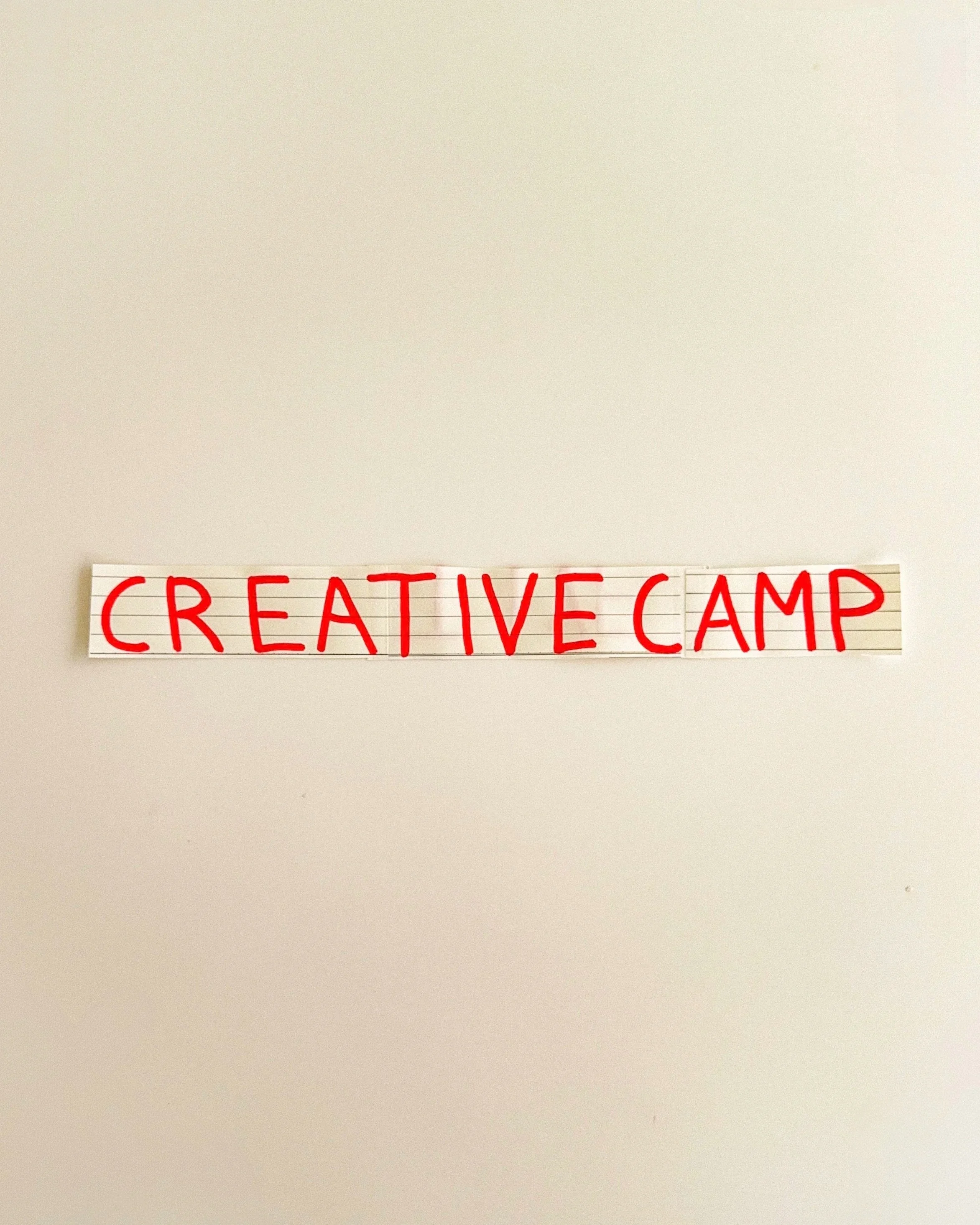
day 01: establish a visual identity for creative camp, beginning with a handwritten logo, red typography and a simple graphic direction that would remain consistent throughout the project.
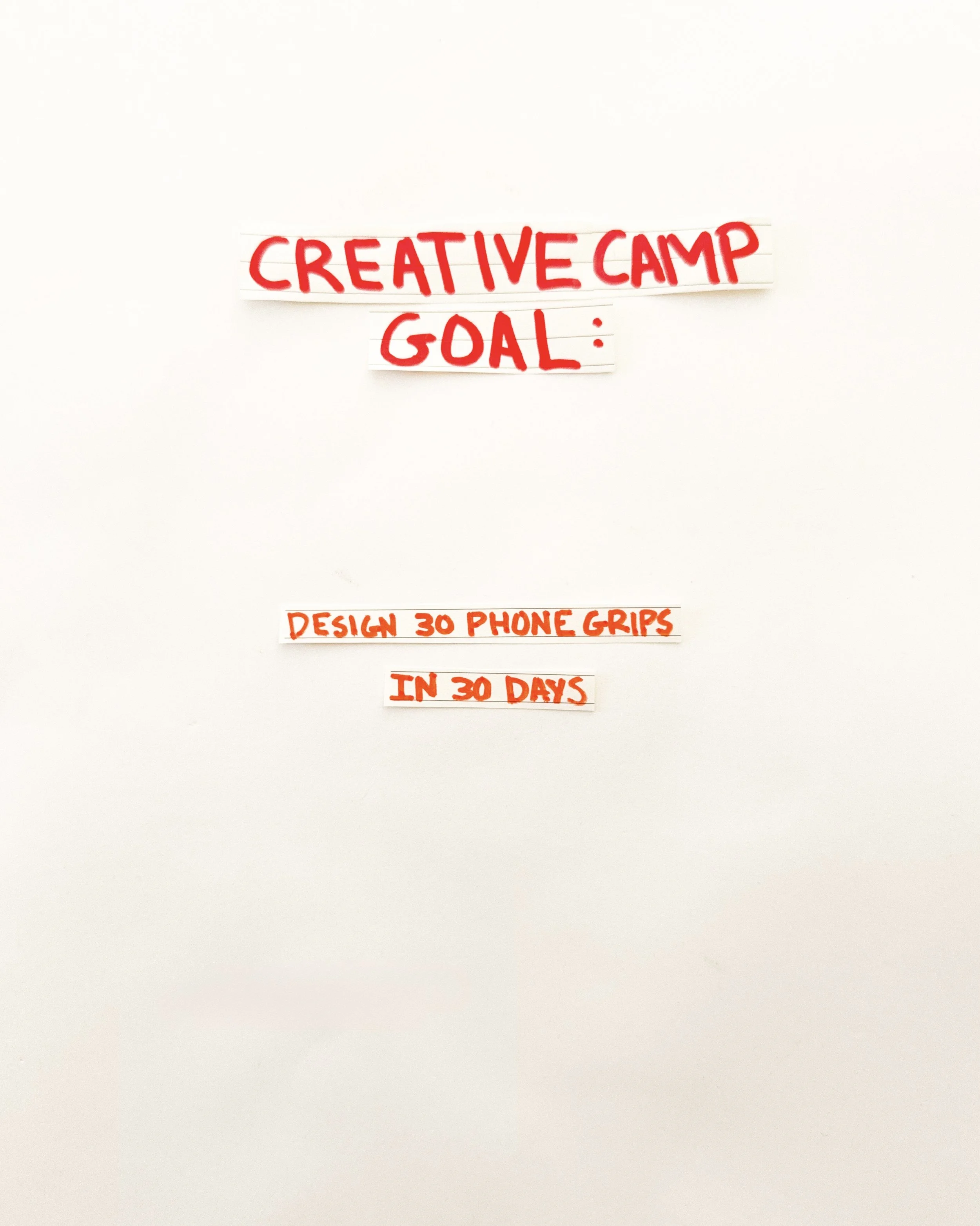
day 02: establish the goal of creative camp. design 30 phone grip prototypes in 30 days, using physical experimentation to explore different shapes, colours, materials and functions.
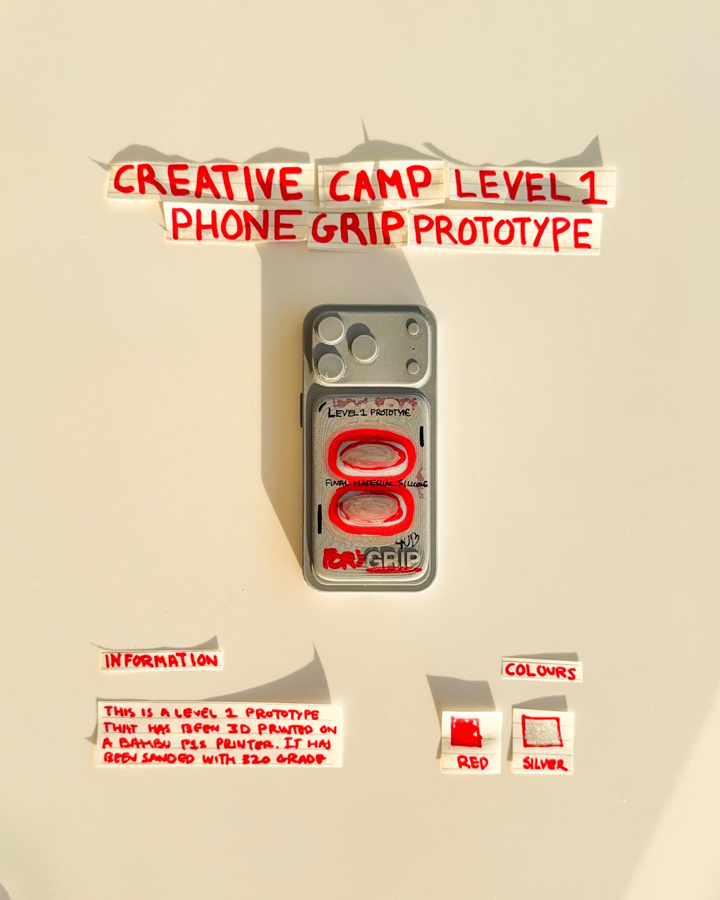
day 03: prototype 01. explore a rectangular phone grip with a horizontal finger opening, testing how a simple pull-tab mechanism could improve comfort, stability and everyday handling.
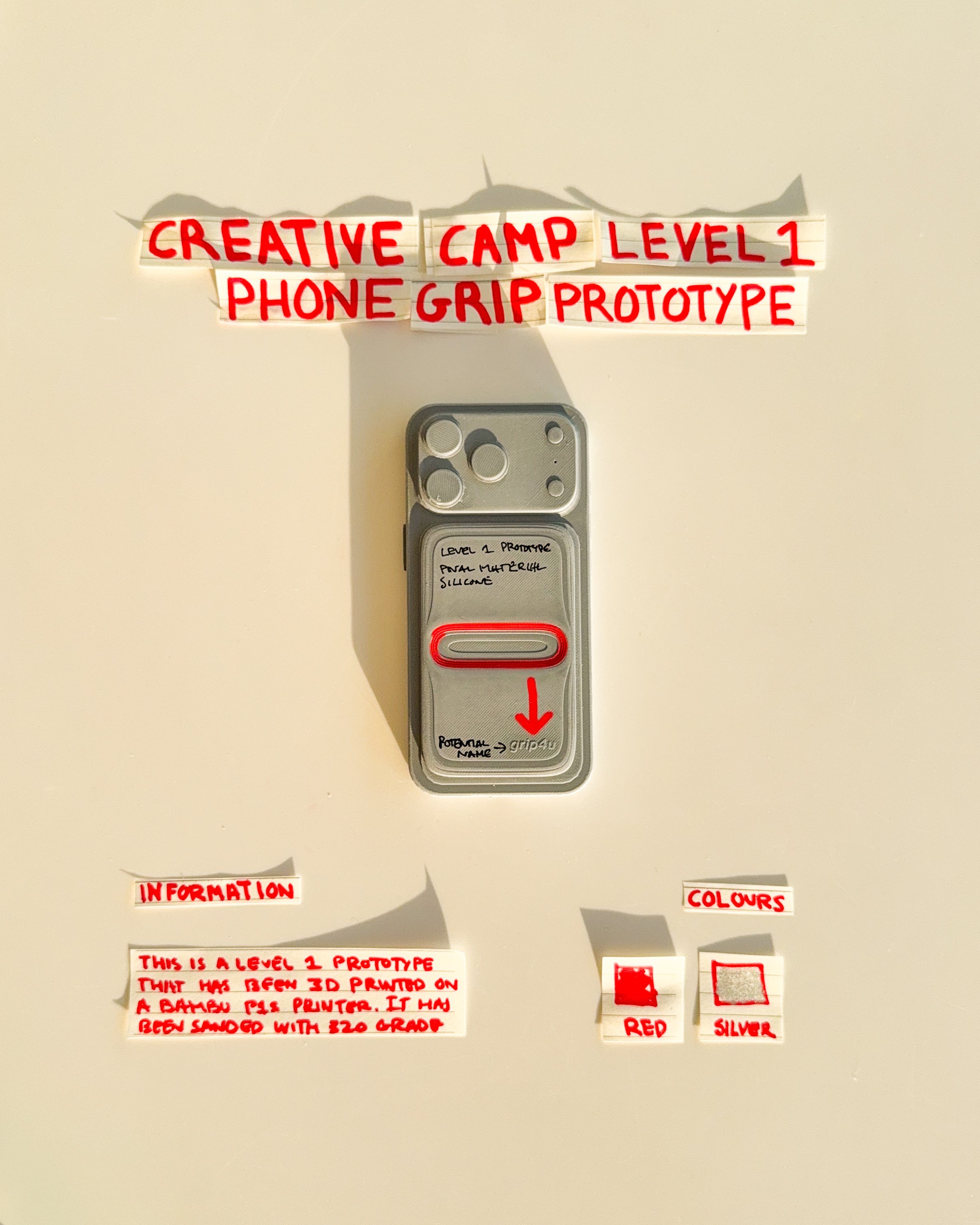
day 04: prototype 02. introduce custom typography and graphic details to a rectangular grip, exploring how colour, branding and surface treatments can transform a simple functional object.
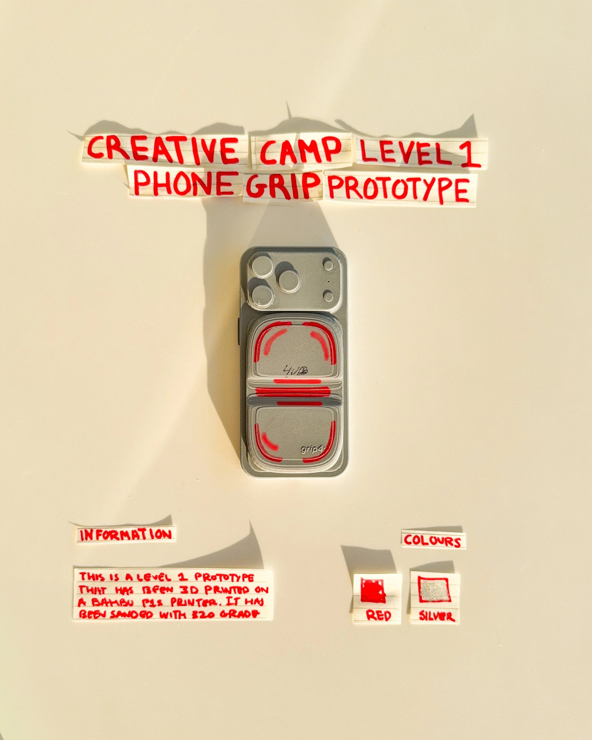
day 05: prototype 03. experiment with two stacked rectangular sections and a repeating graphic pattern, exploring the relationship between visual texture, symmetry and the overall shape of the grip.
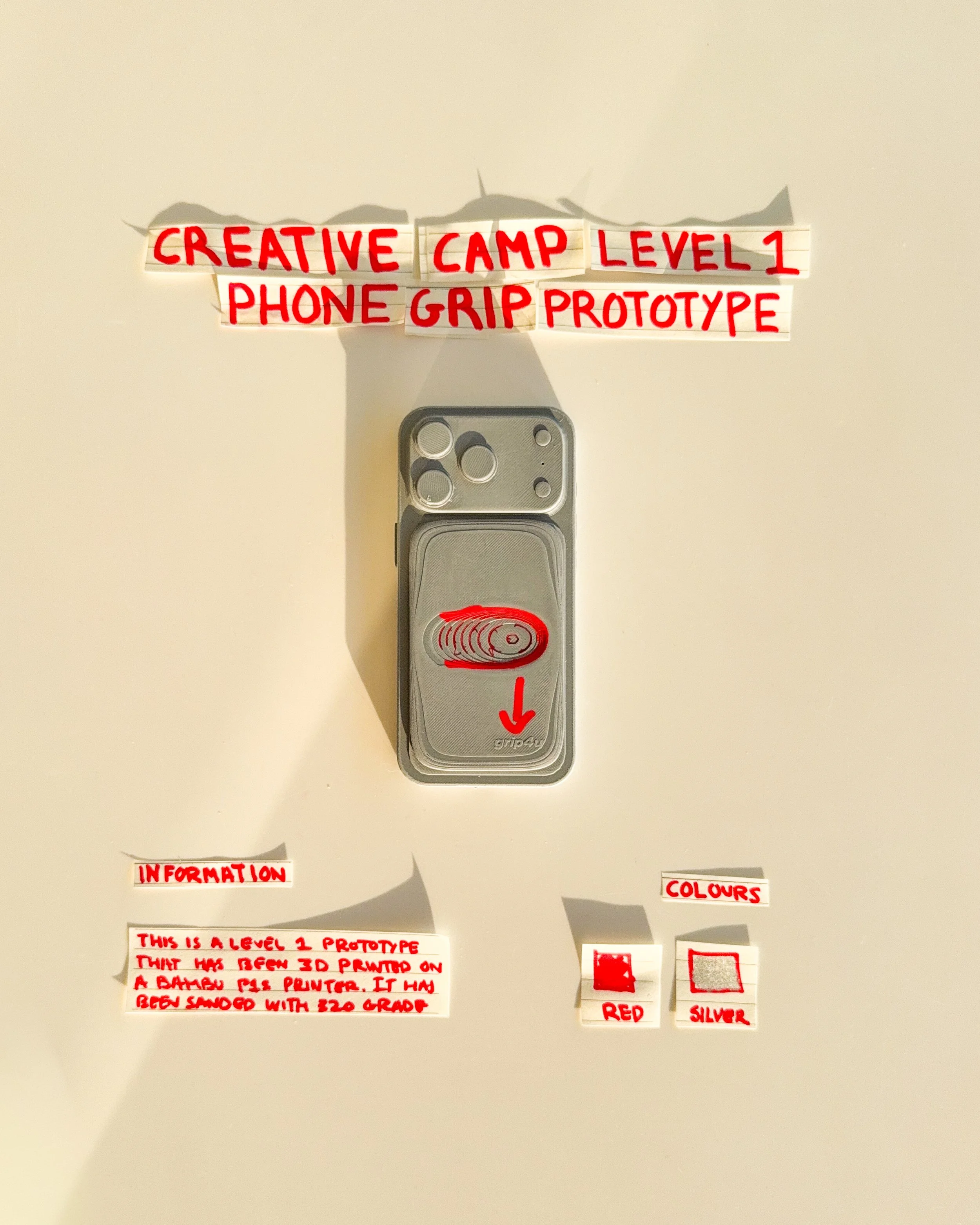
day 06: prototype 04. refine the original horizontal grip concept with a smaller finger opening, simplified lettering and a more compact arrangement of functional and graphic elements.
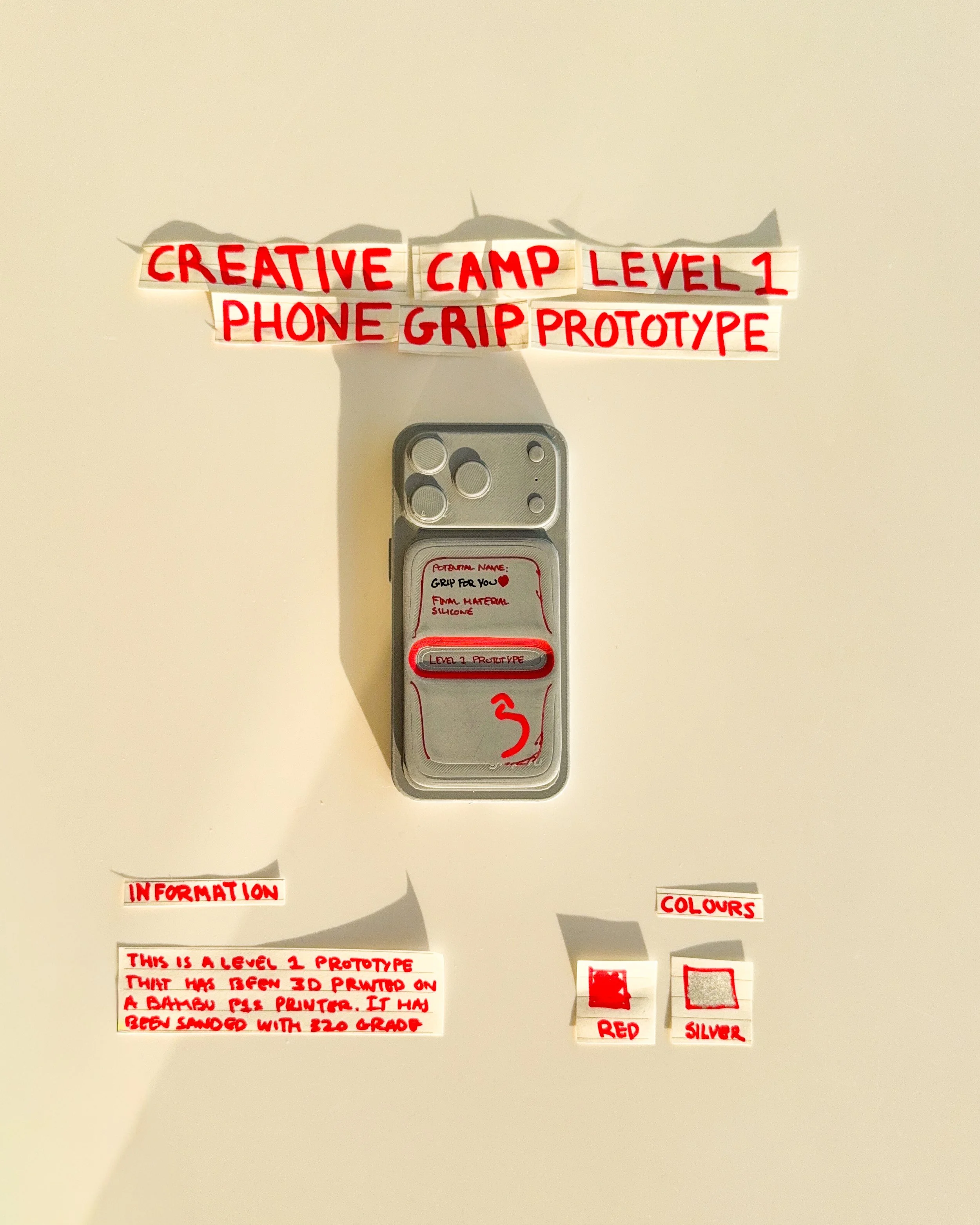
day 07: prototype 05. experiment with a raised central grip and horizontal movement, exploring different finger positions and how the shape of the mechanism affects everyday handling.
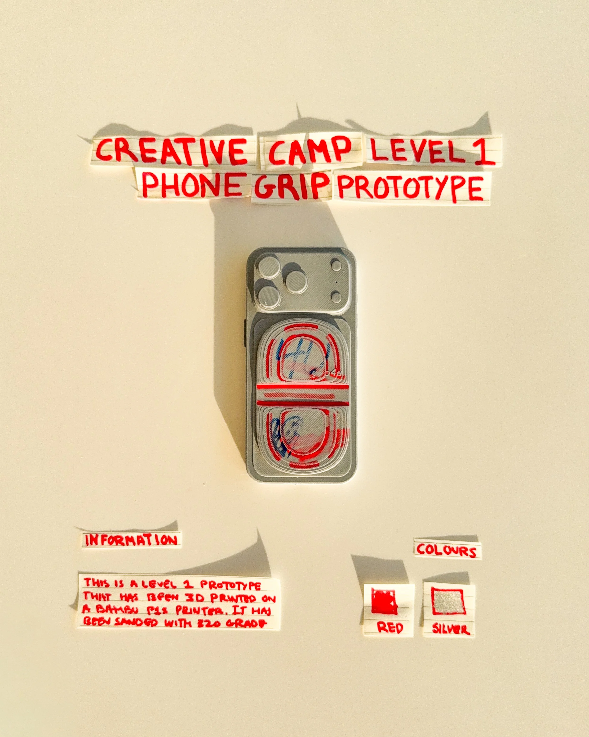
day 08: prototype 06. introduce custom lettering, graphic details and a horizontal finger opening, exploring how typography can be incorporated directly into the surface of a functional phone grip.
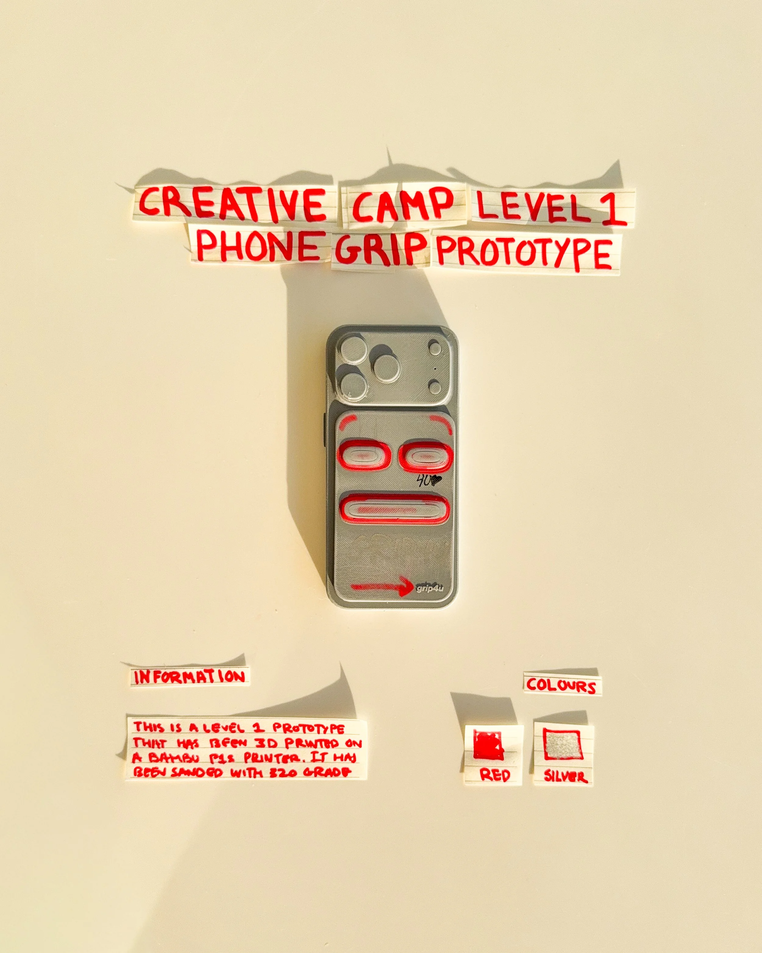
day 09: prototype 07. explore three horizontal grip openings arranged vertically, experimenting with repeated shapes, spacing and alternative finger positions within a single rectangular phone attachment.
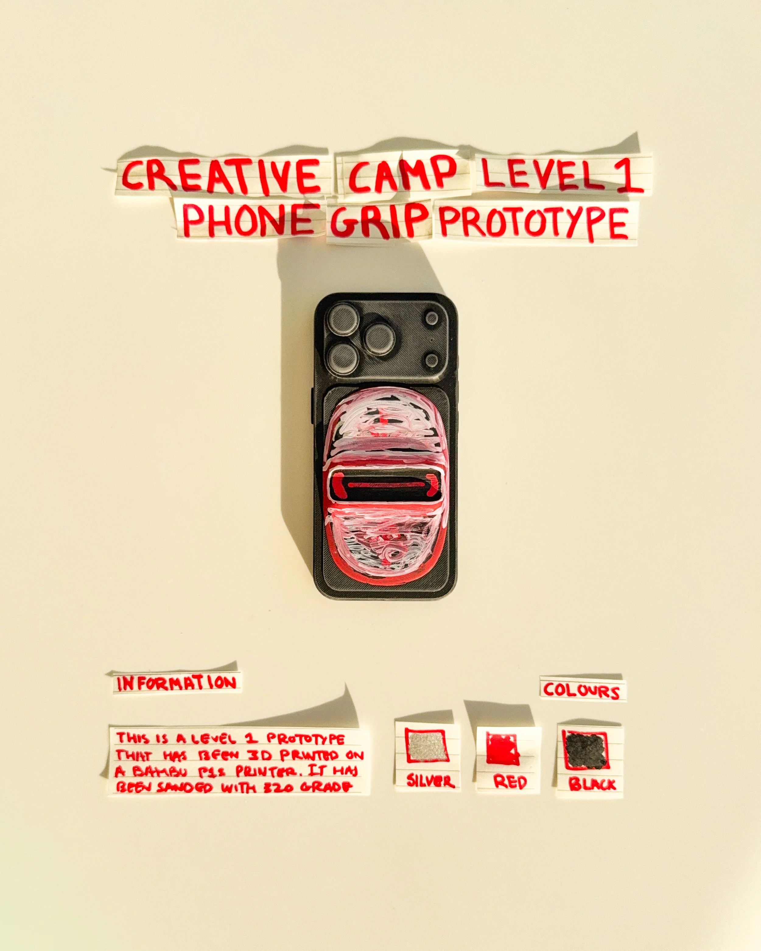
day 10: prototype 08. introduce a rounded body with a central horizontal finger opening, exploring softer edges, graphic surface treatments and the contrast between organic and structured shapes.
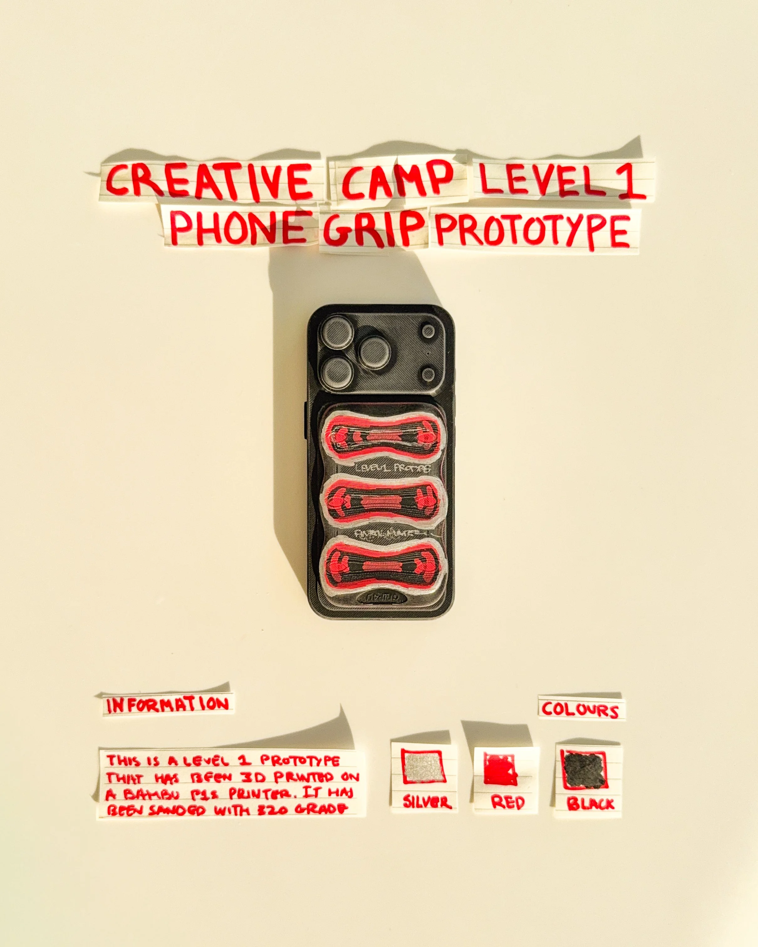
day 11: prototype 09. develop a three-section grip with individual horizontal openings, exploring how multiple finger placements and repeated forms can create a different approach to holding a phone.
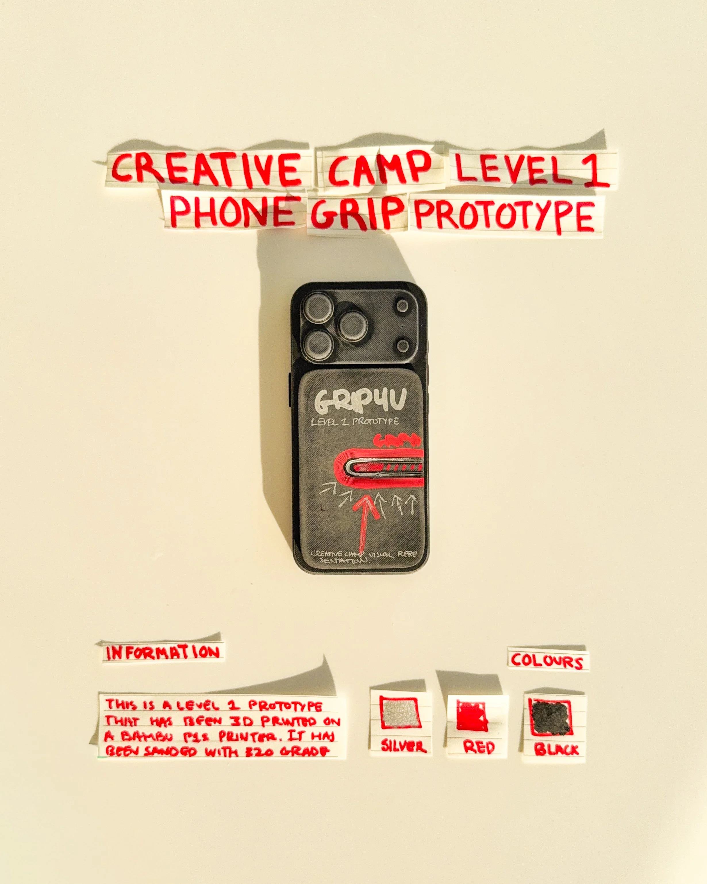
day 12 prototype 10: explore a rectangular phone grip with handwritten graphics, red detailing and a horizontal finger opening. the design combines functional elements with a more expressive visual identity.
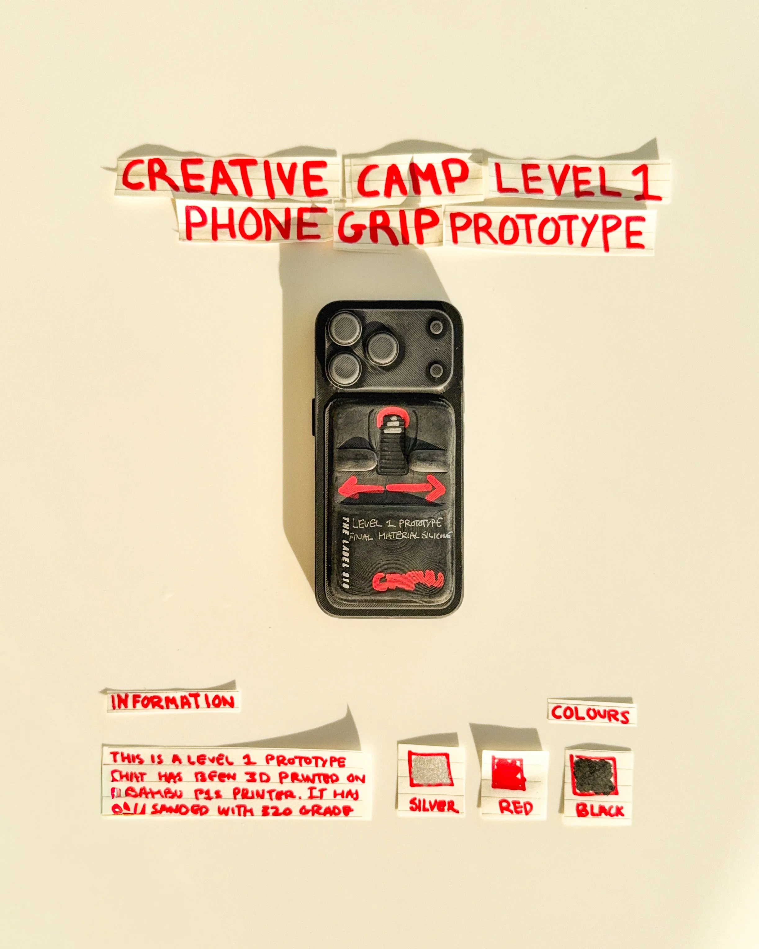
day 13 prototype 11: develop a rectangular phone grip with a horizontal finger opening, red accents and handwritten typography. the design explores the relationship between finger placement, function and graphic details.
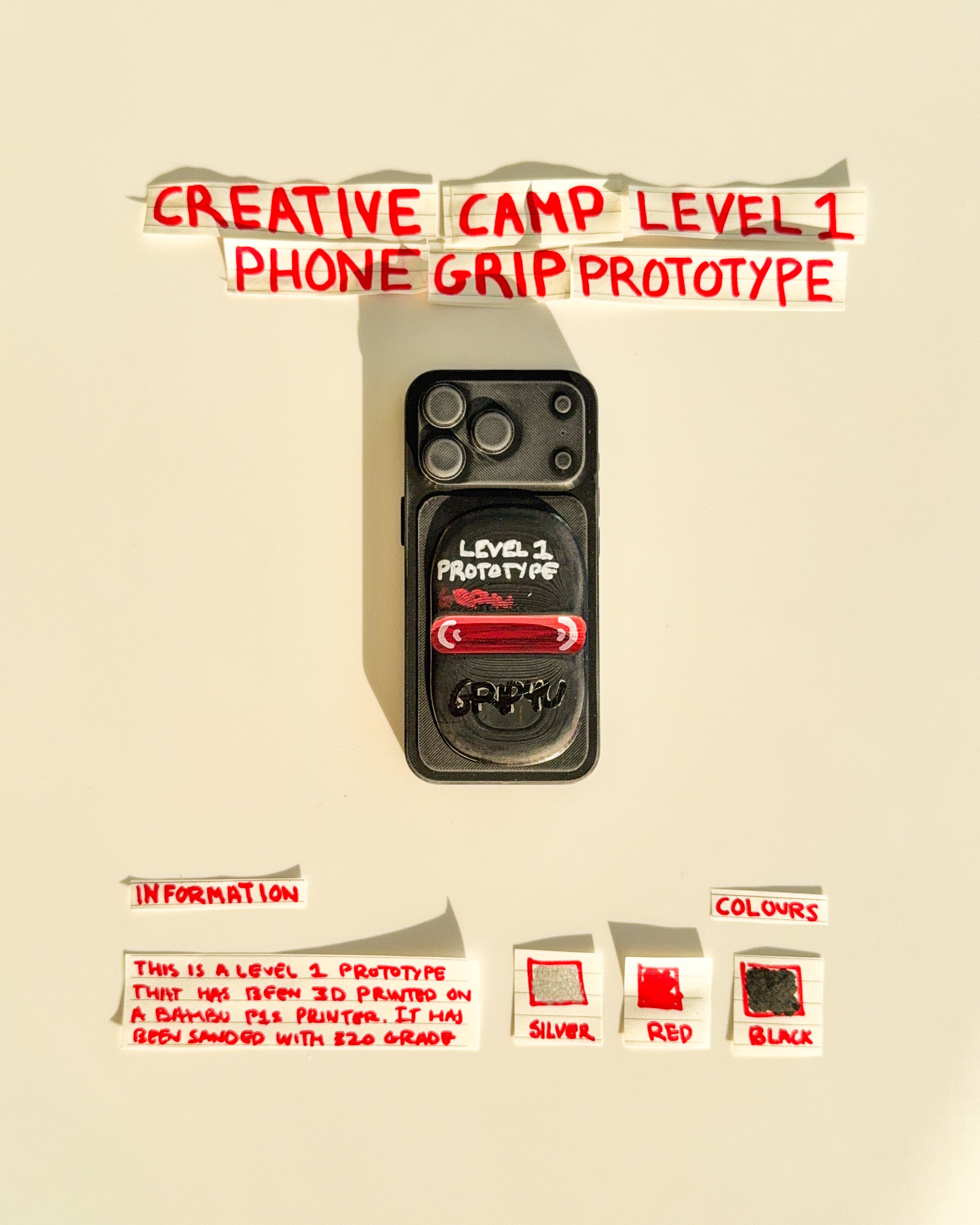
day 14 prototype 12: experiment with two rectangular sections featuring repeating red graphic patterns. the design explores surface texture, symmetry and how decorative elements can change the appearance of a grip.
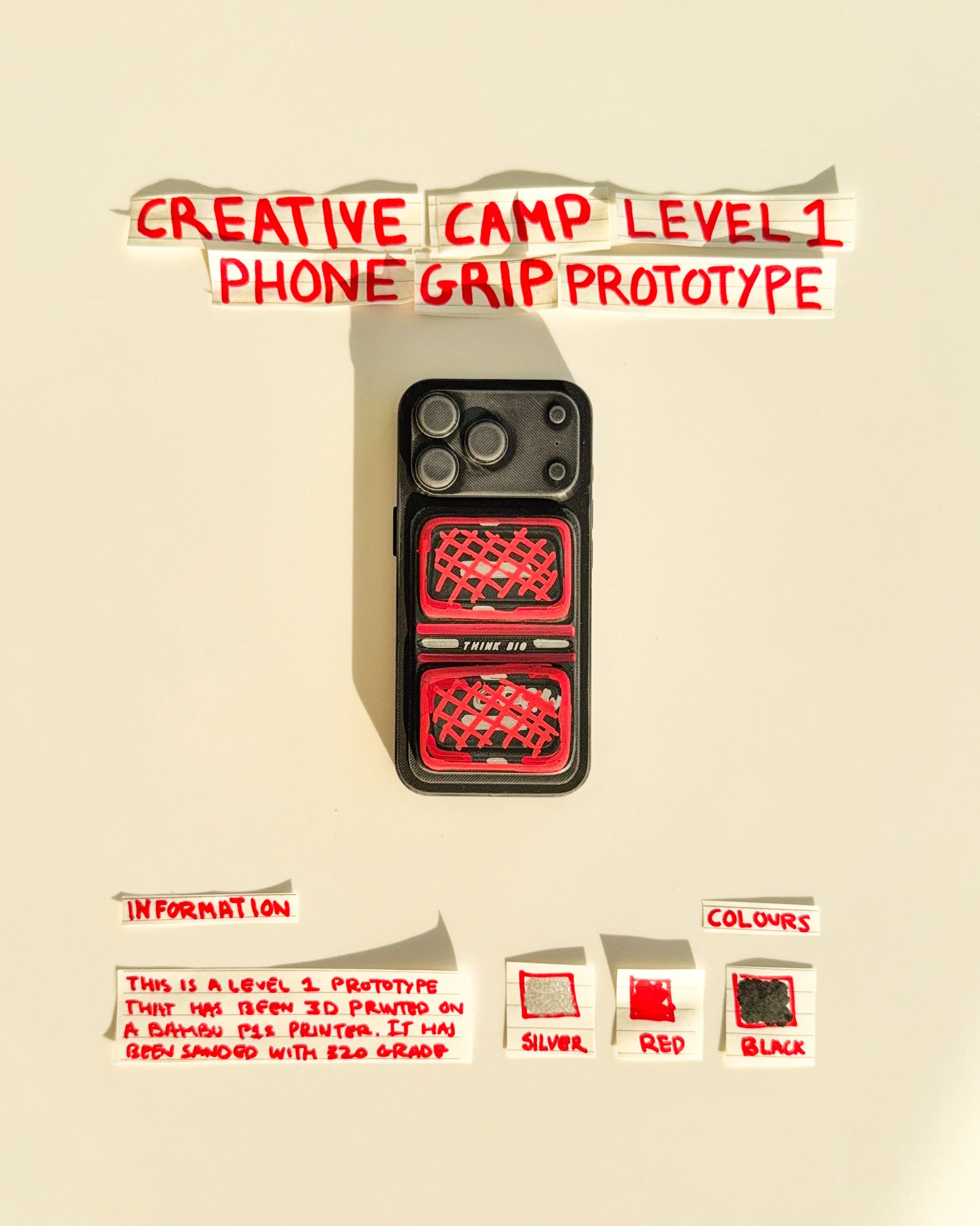
day 15 prototype 13: explore a rectangular phone grip with a narrow horizontal opening and handwritten typography. the design combines a simplified functional shape with graphic experimentation.
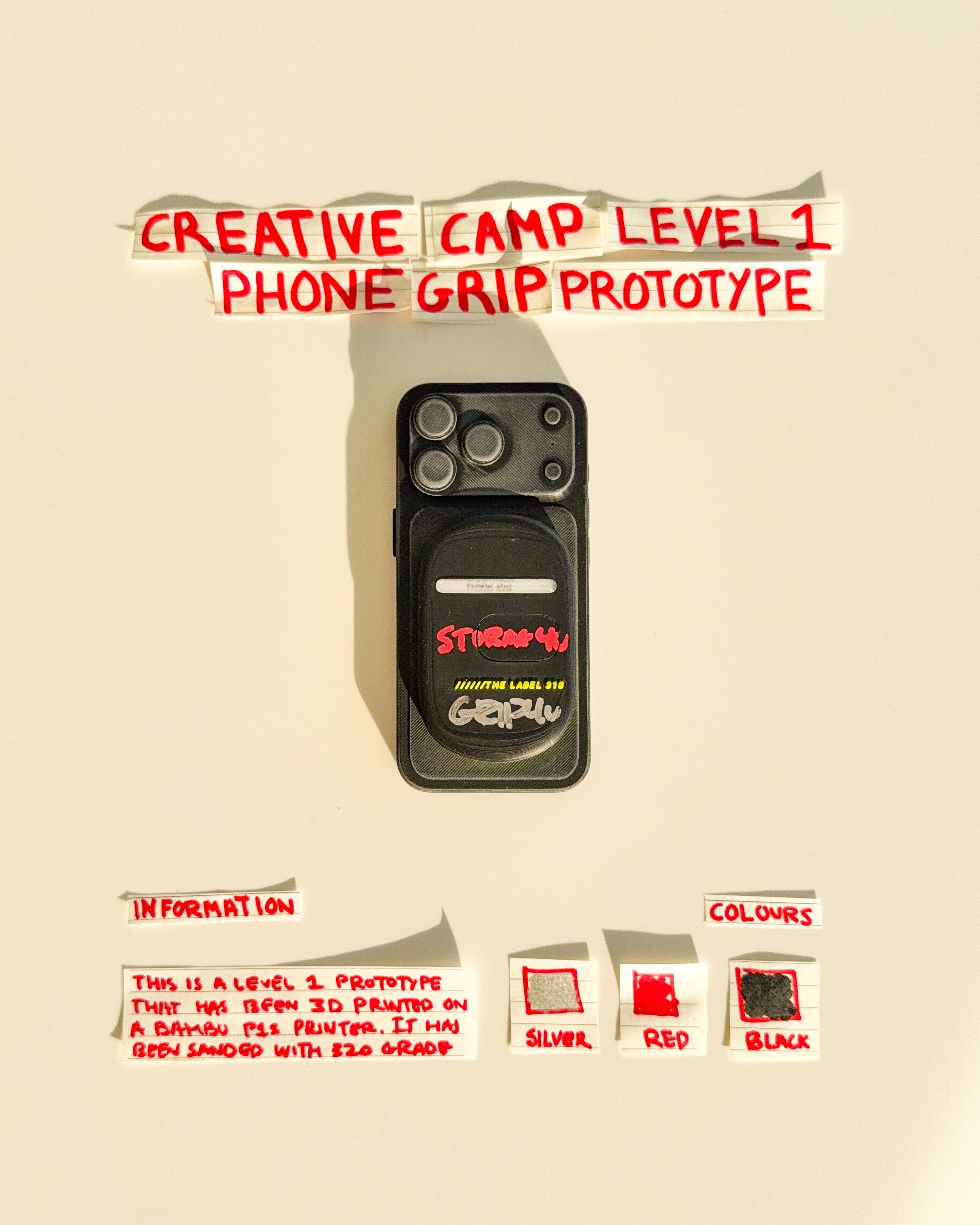
day 16 prototype 14: refine the rectangular phone grip with a single horizontal finger opening, red detailing and custom lettering. the design focuses on simplifying the overall shape while maintaining its function.
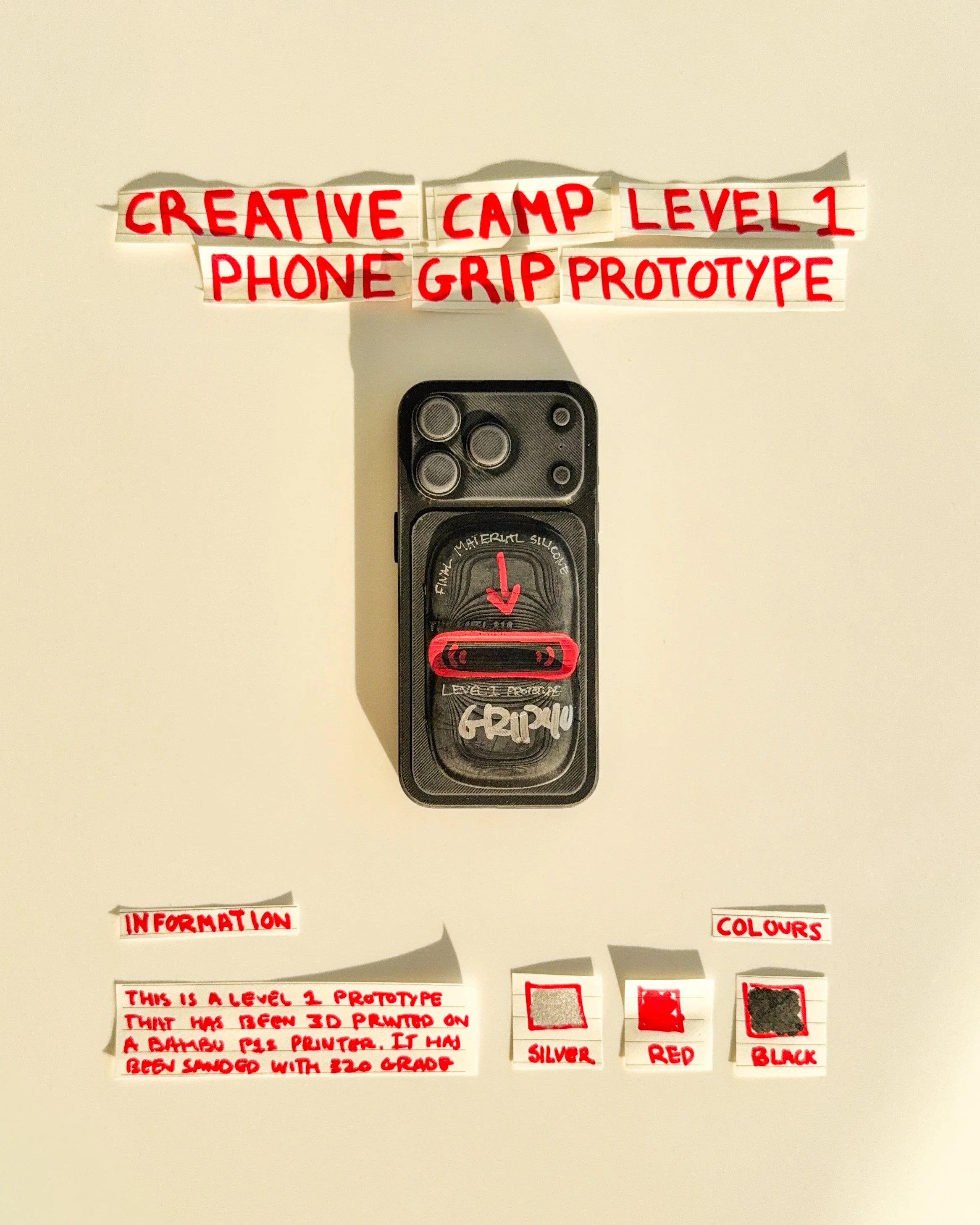
day 17 prototype 15: experiment with three horizontal finger openings arranged vertically within a rectangular body. the design explores repeated shapes, alternative finger positions and functional flexibility.
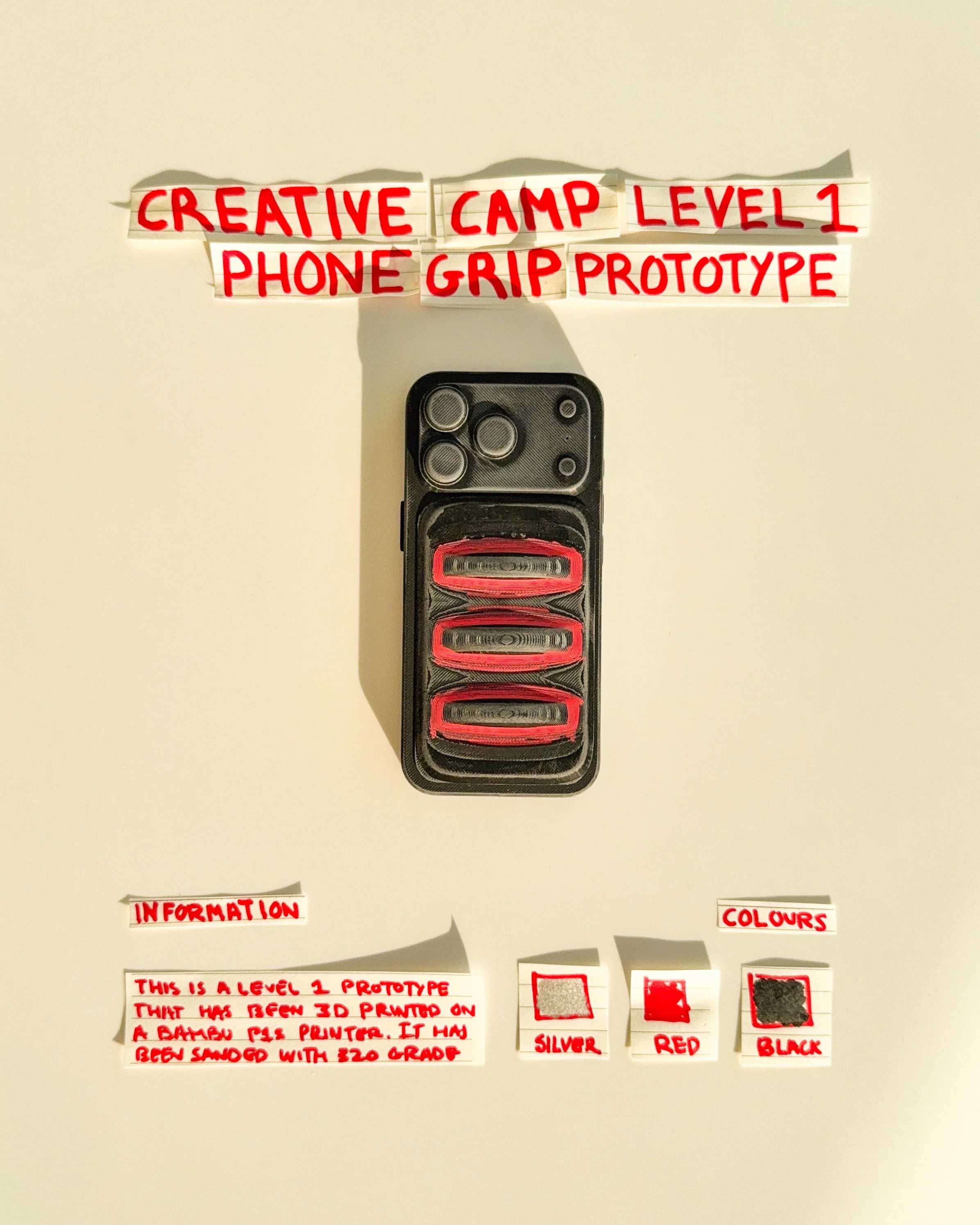
day 18 prototype 16: explore a black rectangular phone grip with a central oval opening and minimal graphic details. the design focuses on finger placement, simplified proportions and everyday comfort.
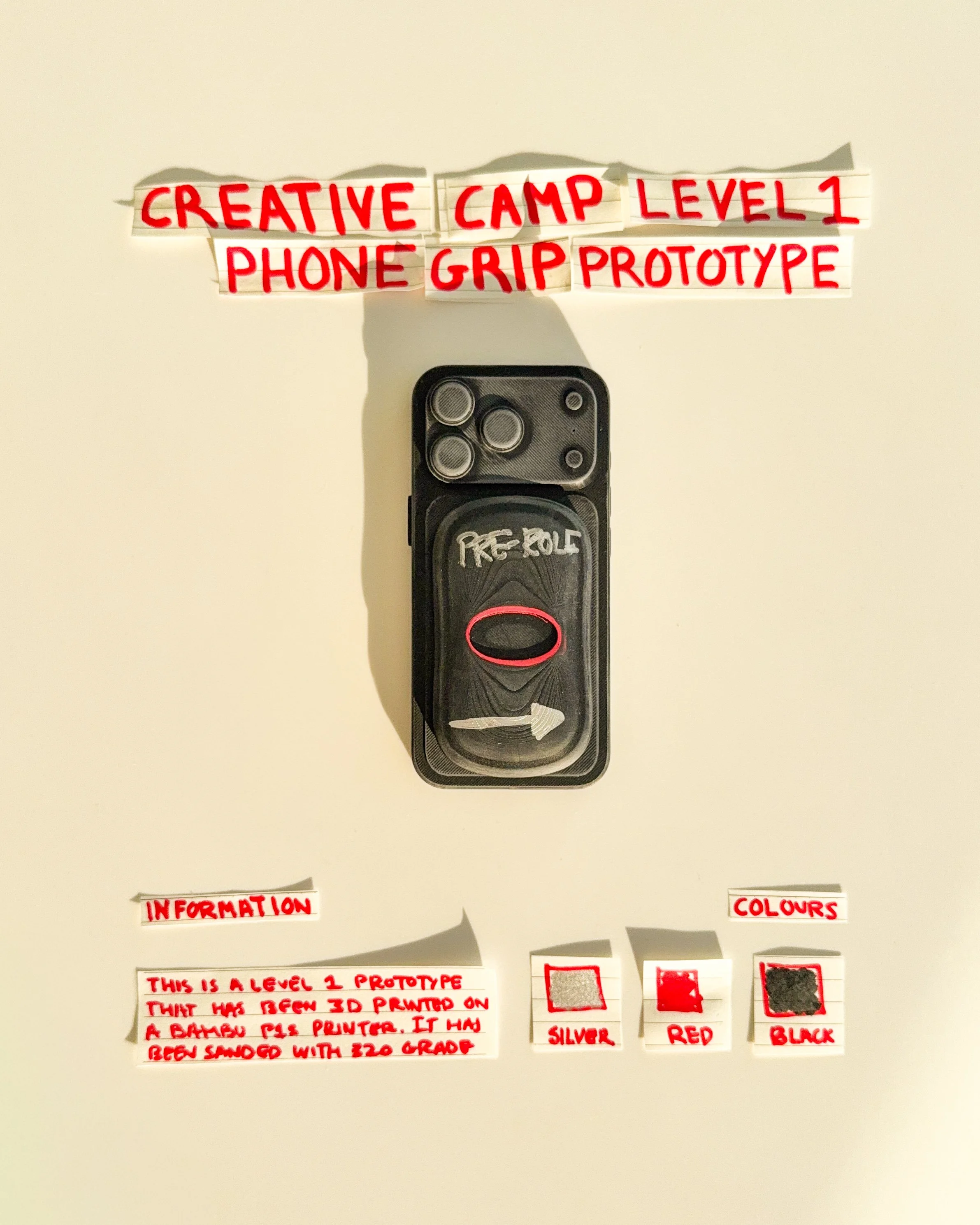
day 19 prototype 17: develop a white rectangular phone grip featuring custom lettering, directional graphics and red accents. the design explores how simple typography can create a recognizable visual identity.
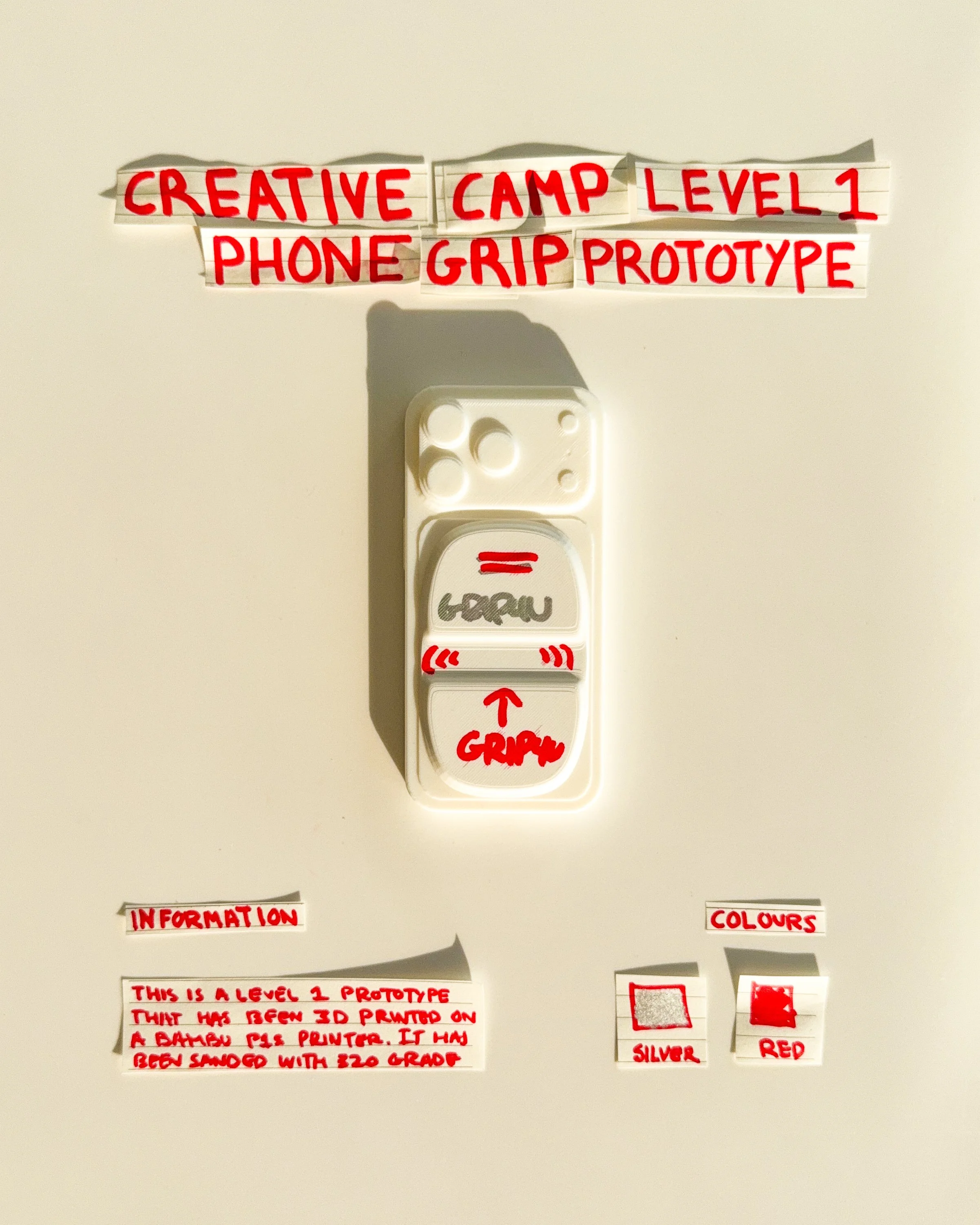
day 20 prototype 18: experiment with a white rectangular body, handwritten typography and a central finger opening. the design explores the relationship between colour, graphic placement and function.
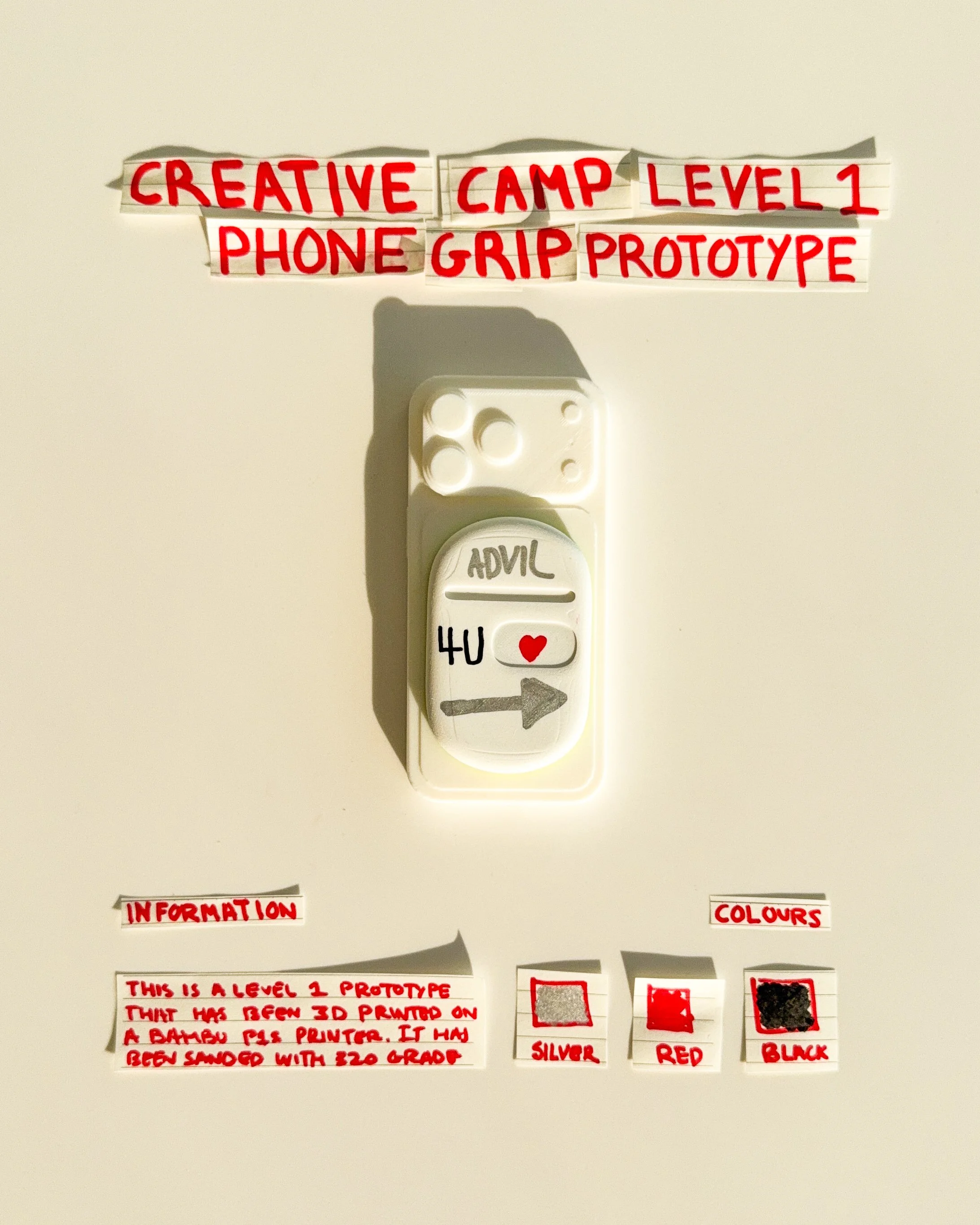
day 21 prototype 19: explore a white rectangular phone grip with handwritten typography, a small red heart and directional graphics. the design combines a simplified shape with expressive details and a playful visual identity.
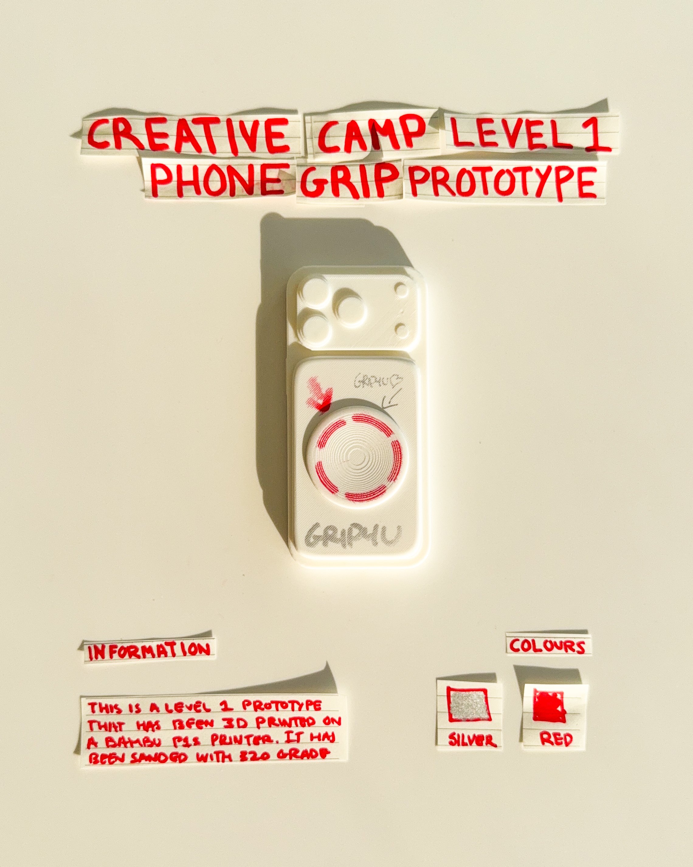
day 22 prototype 20: experiment with a repeating red and green graphic pattern across a white rectangular body. the design explores symmetry, colour combinations and how surface graphics can create a distinct visual identity.
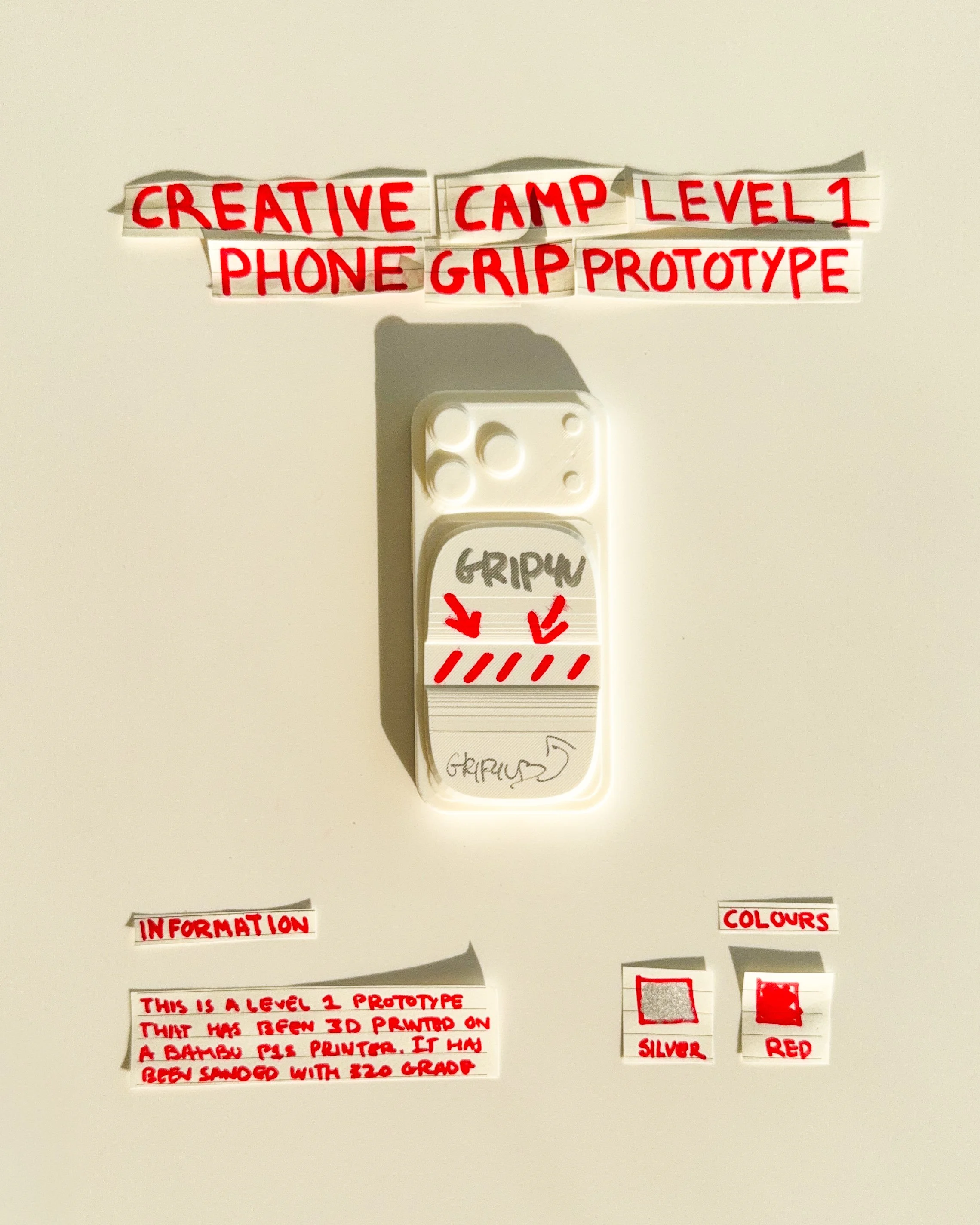
day 23 prototype 21: develop a white rectangular phone grip featuring two circular graphics and a horizontal finger opening. the design explores the relationship between repeated shapes, finger placement and red detailing.
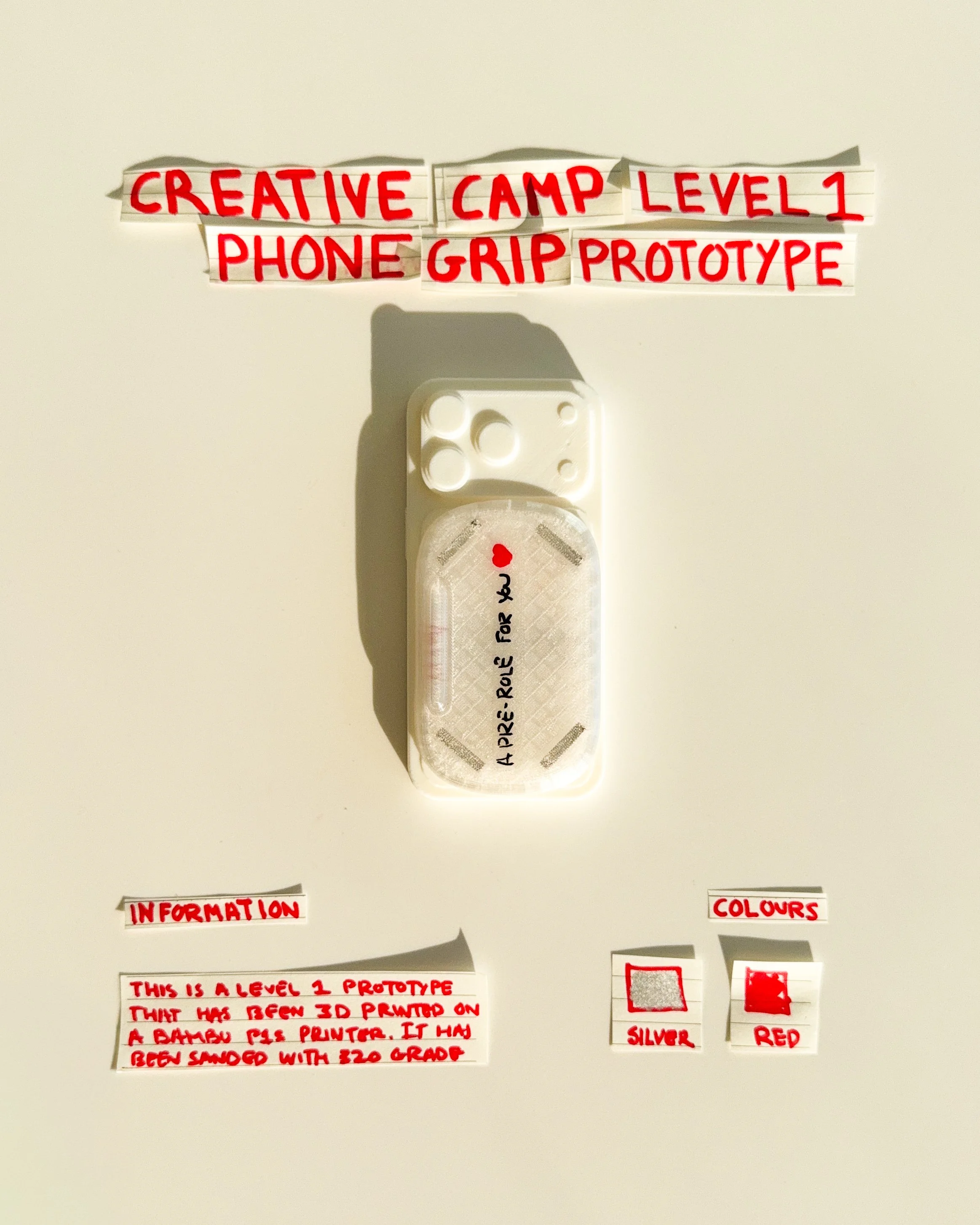
day 24 prototype 22: explore a white rectangular phone grip with a translucent surface and vertically arranged typography. the design focuses on material appearance, minimal graphic placement and simplified proportions.
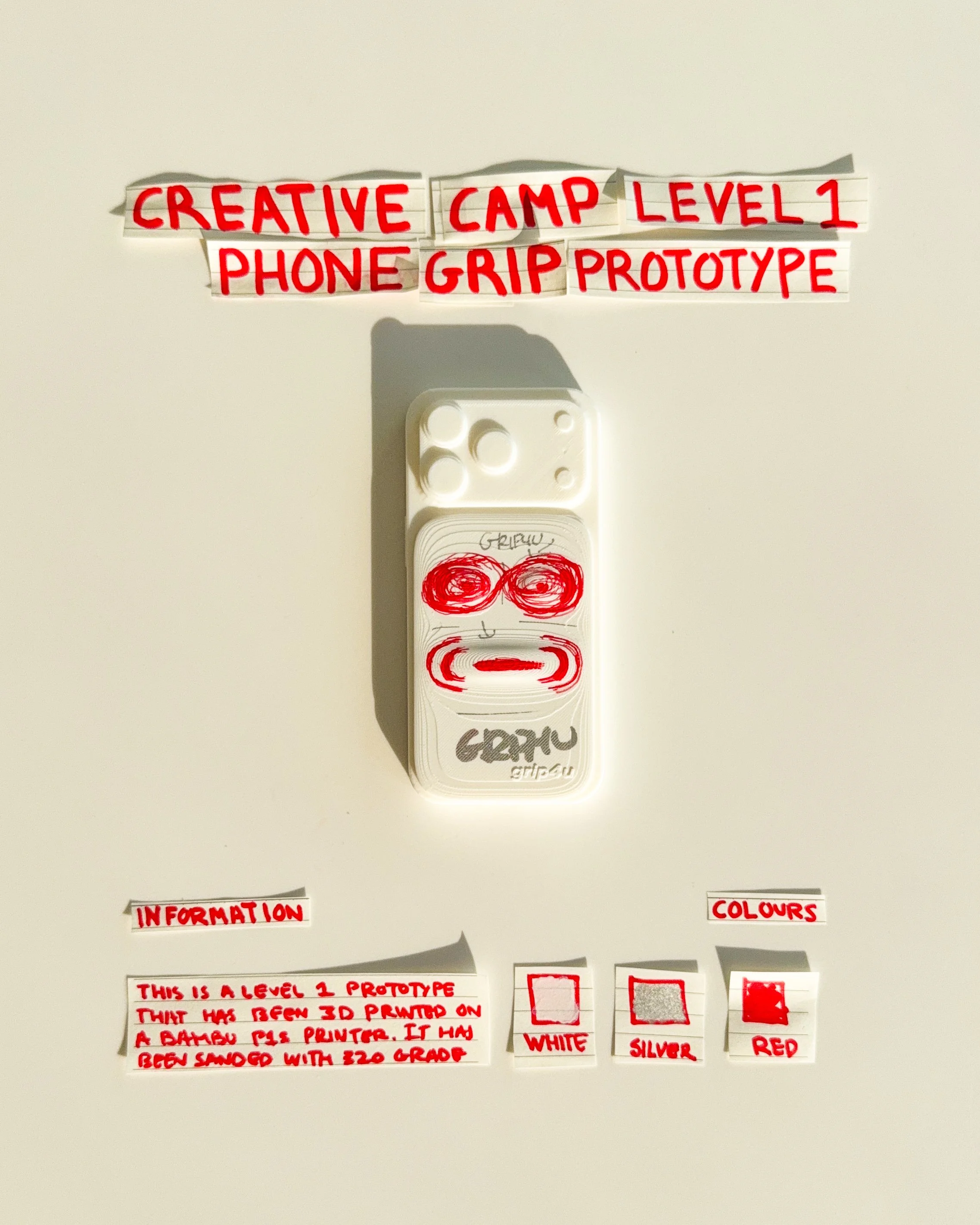
day 25 prototype 23: experiment with a white rectangular phone grip featuring handwritten lettering, red arrows and diagonal stripes. the design explores graphic placement, directional elements and visual contrast.
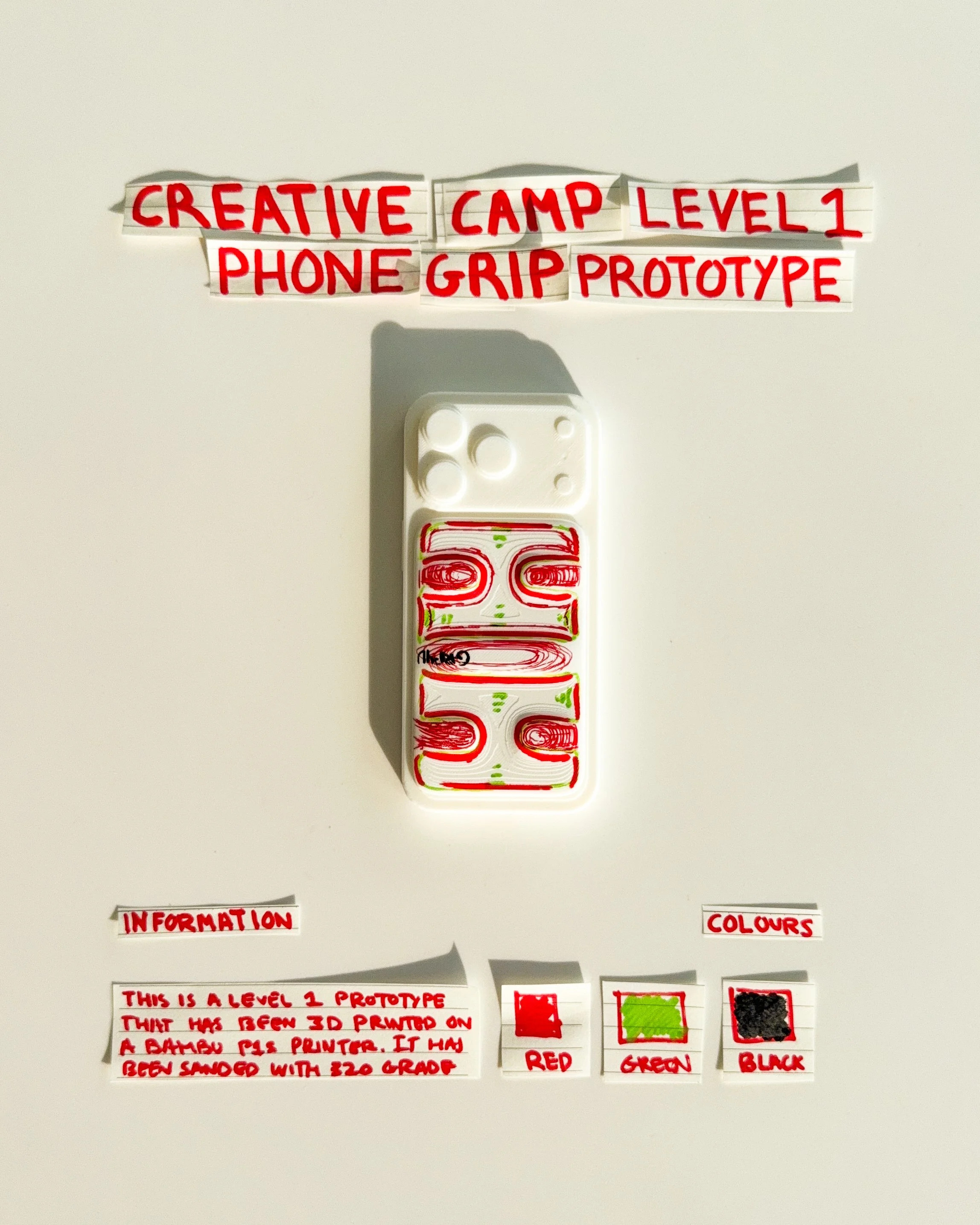
day 26 prototype 24: explore a white rectangular phone grip featuring a central circular graphic, red detailing and handwritten typography. the design focuses on geometric simplicity, balanced proportions and visual identity.
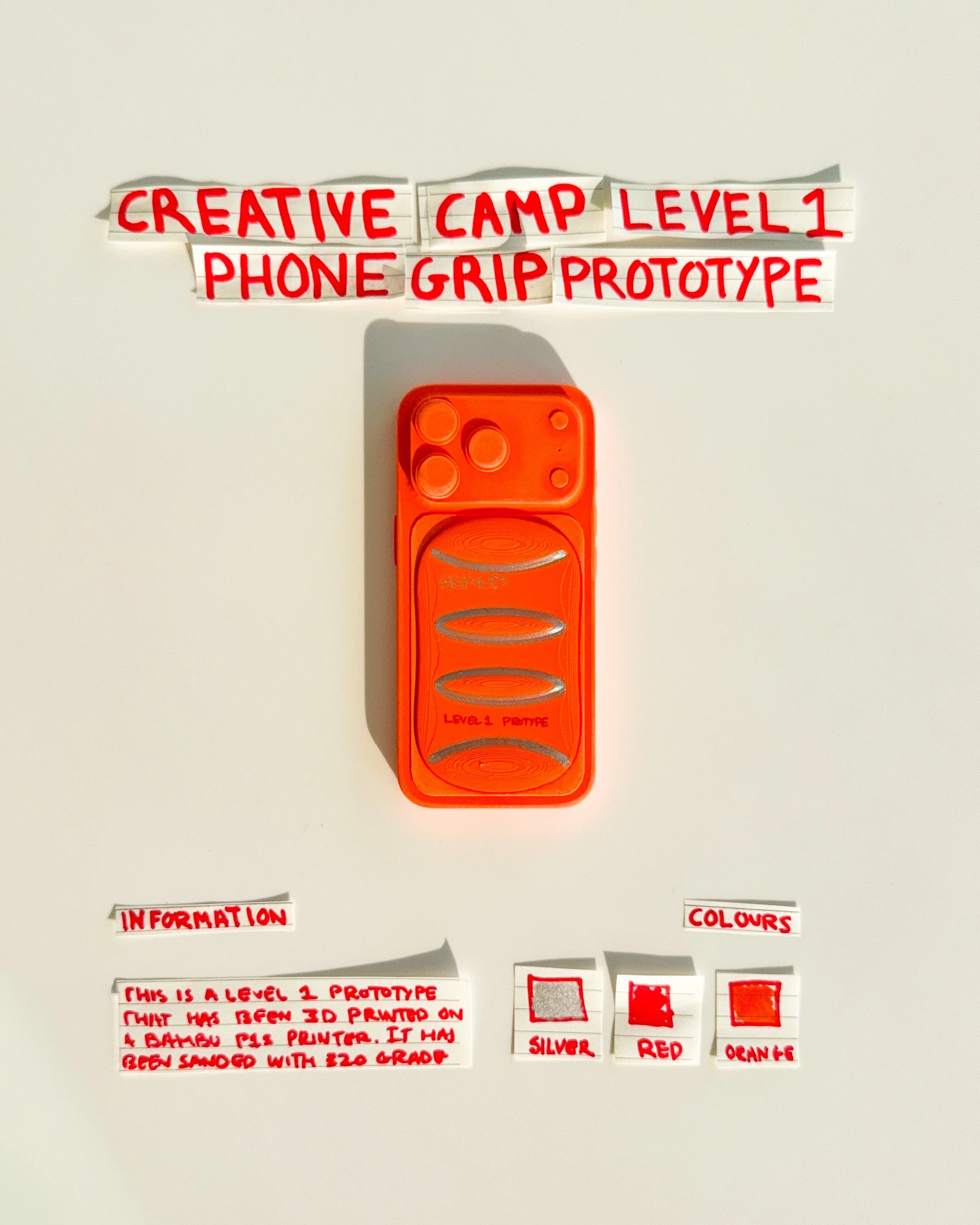
day 27 prototype 25: explore an orange rectangular phone grip featuring three horizontal oval openings and silver detailing. the design focuses on repeated geometry, finger placement and creating a more functional visual identity.
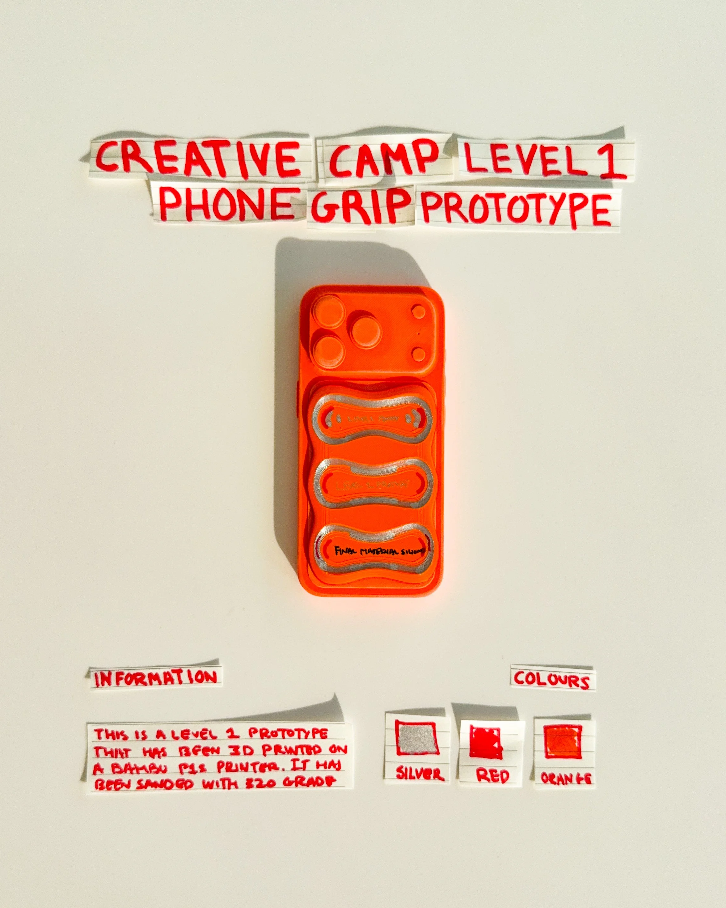
day 28 prototype 26: experiment with an orange rectangular phone grip featuring sculpted horizontal openings and handwritten graphics. the design explores surface texture, raised details and the relationship between function and visual expression.
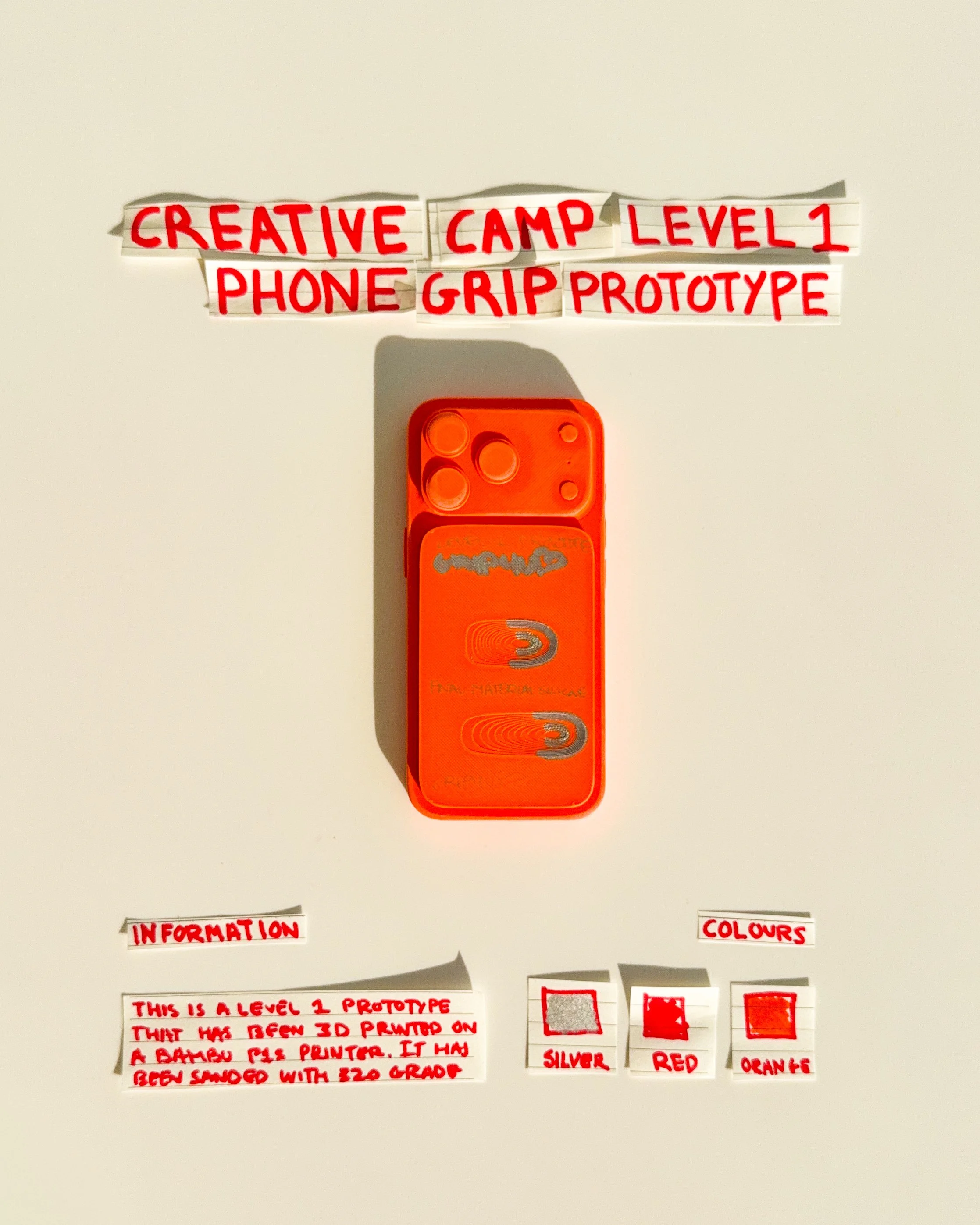
day 29 prototype 27: develop an orange rectangular phone grip featuring two circular finger openings, black outlines and directional graphics. the design explores repeated shapes, contrasting details and a more expressive visual identity.
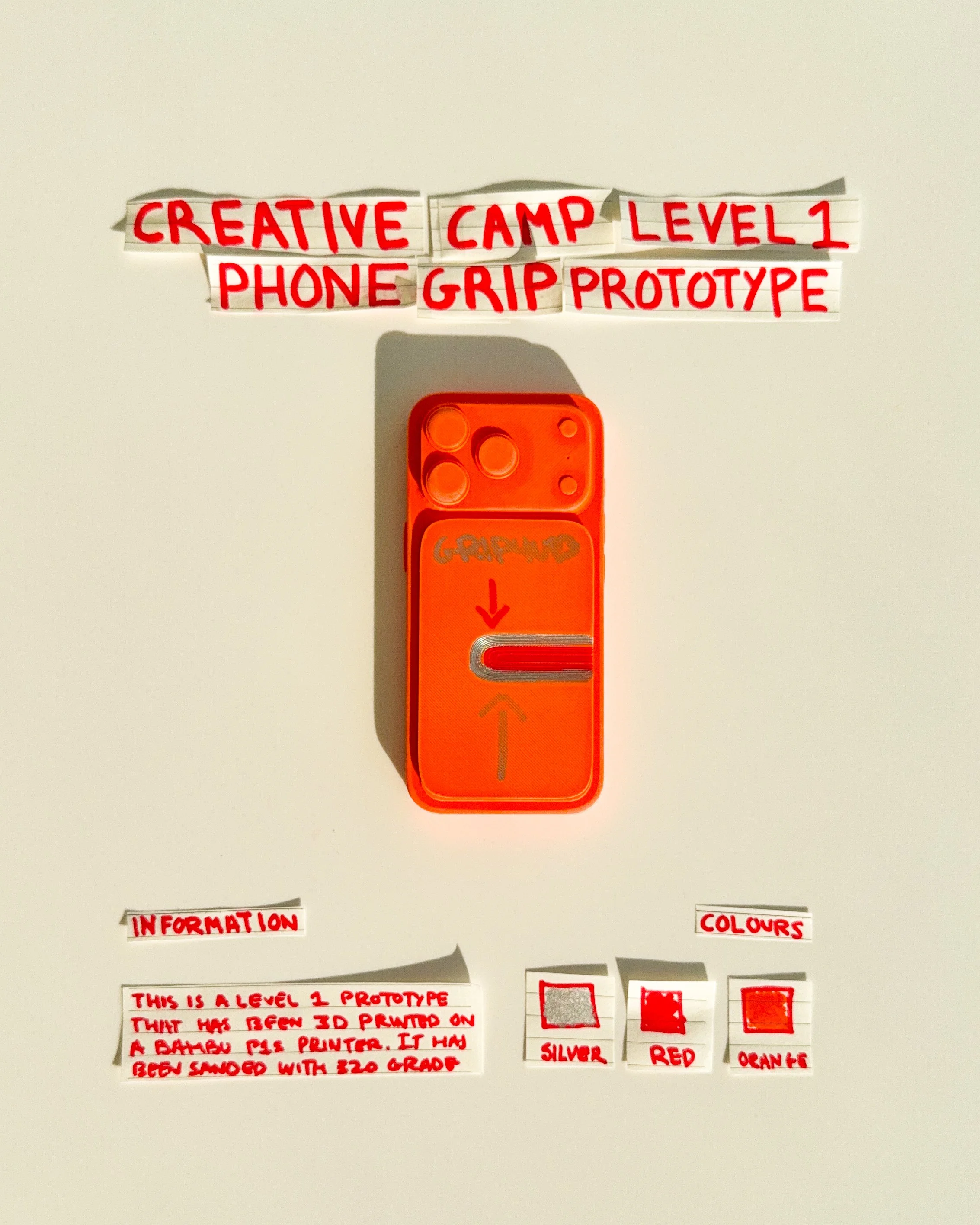
day 30 prototype 28: explore an orange rectangular phone grip with a single horizontal finger opening, silver detailing and handwritten arrows. the design focuses on simplifying the grip mechanism while maintaining a strong visual identity.
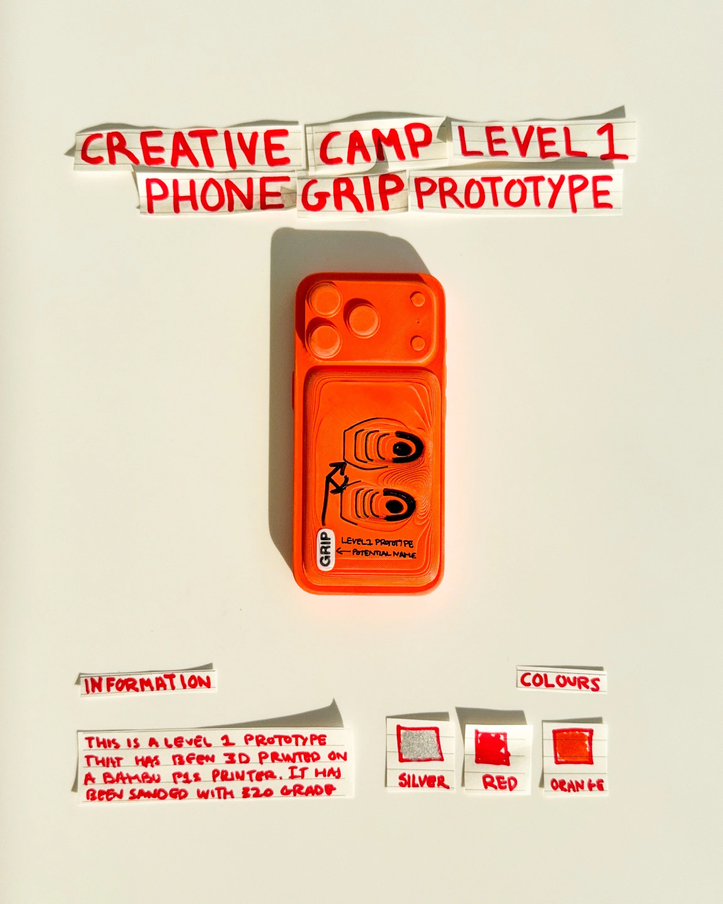
day 30 prototype 29: experiment with an orange rectangular phone grip featuring two horizontal finger openings and minimal silver graphics. the design explores functional symmetry, simplified geometry and a more refined surface treatment.
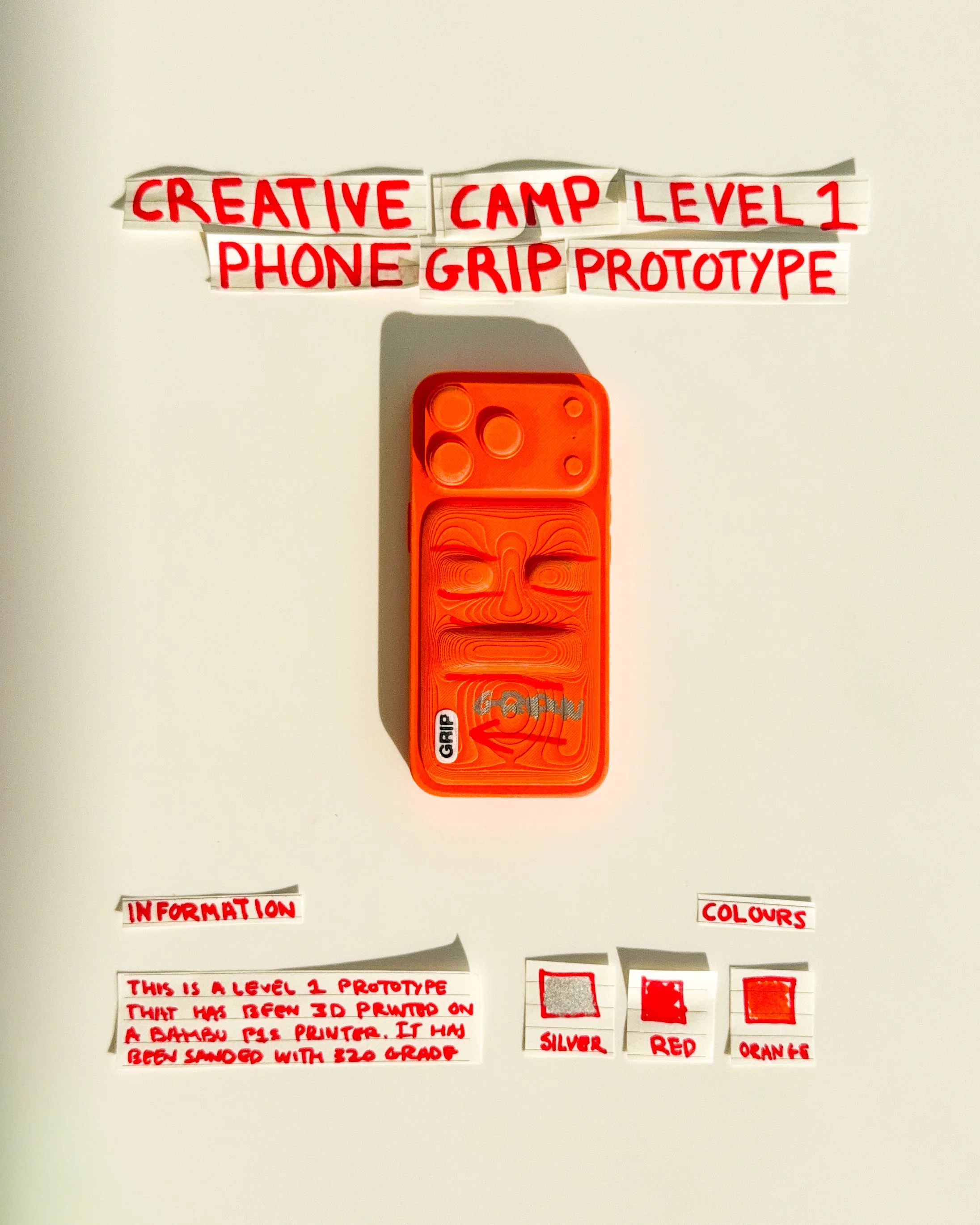
day 30 prototype 30: explore an orange rectangular phone grip featuring two elongated horizontal openings with rounded ends and silver outlines. the design focuses on finger positioning, repeated forms and a more structured visual identity.
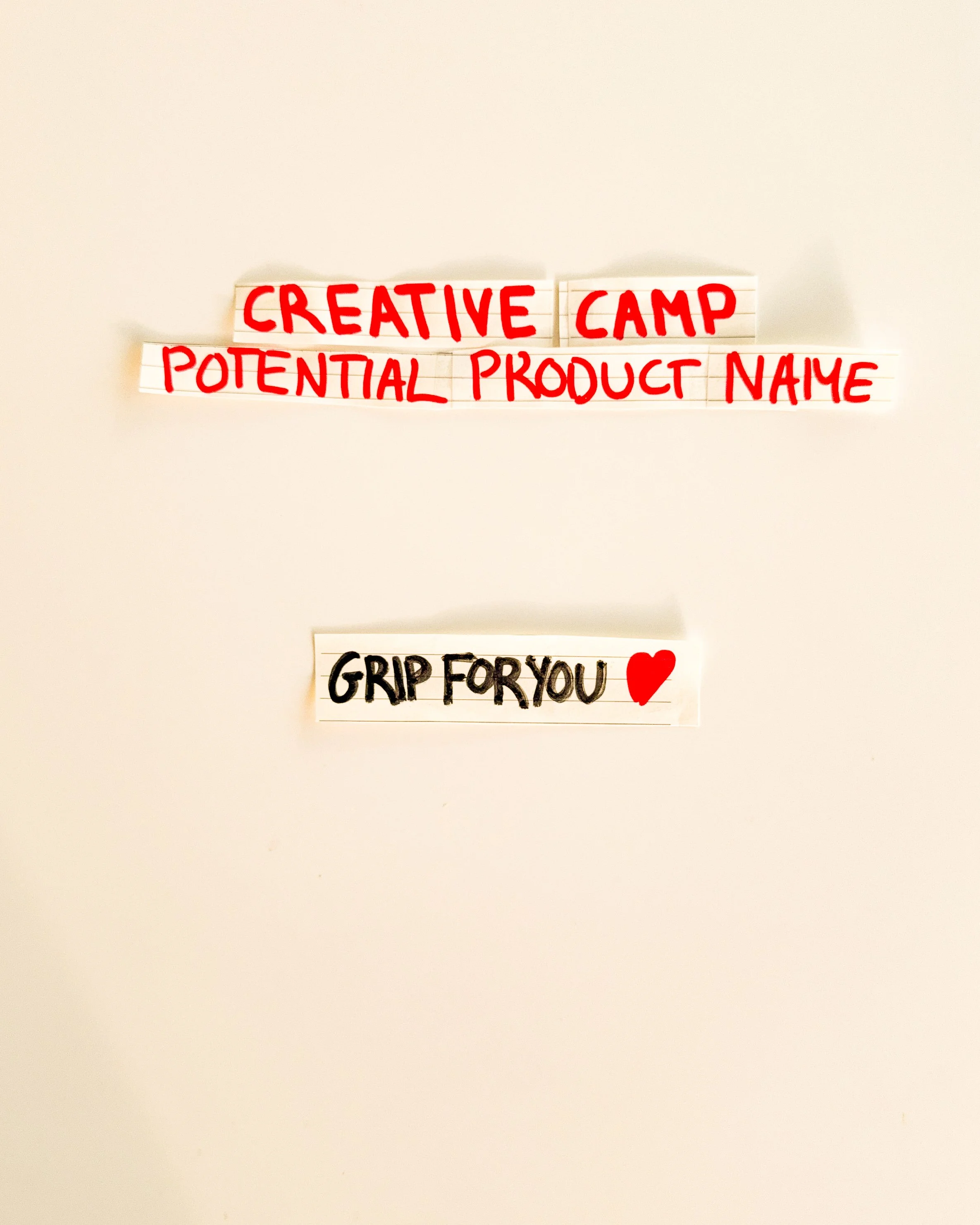
day 30: creative camp product name gripforyou® was explored as a potential name for the phone grip collection. the name reflects a simple approach to product design, combining everyday functionality with a friendly and recognizable identity.
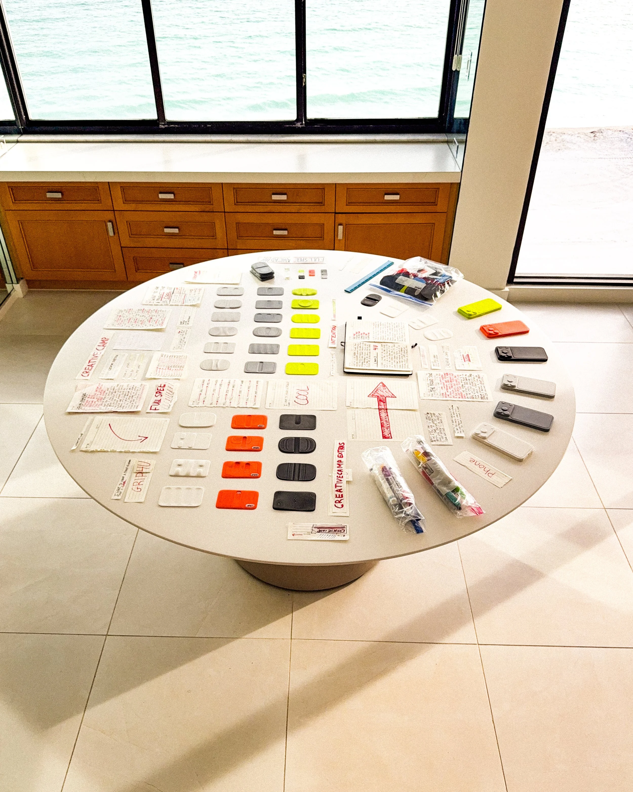
day 30: creative camp overview: 30 phone grip prototypes were developed through a process of sketching, digital modelling and physical 3D printing. each experiment explored different approaches to shape, colour, function and visual identity. together, the prototypes represent the early development of gripforyou® and the foundation for future product collections.