organic shapes
Organic Shapes explores phone grips designed around the natural resting position of the middle and index fingers. The collection focuses on soft curves, recessed surfaces and simple proportions, experimenting with how small changes in shape can influence the way a phone is held.
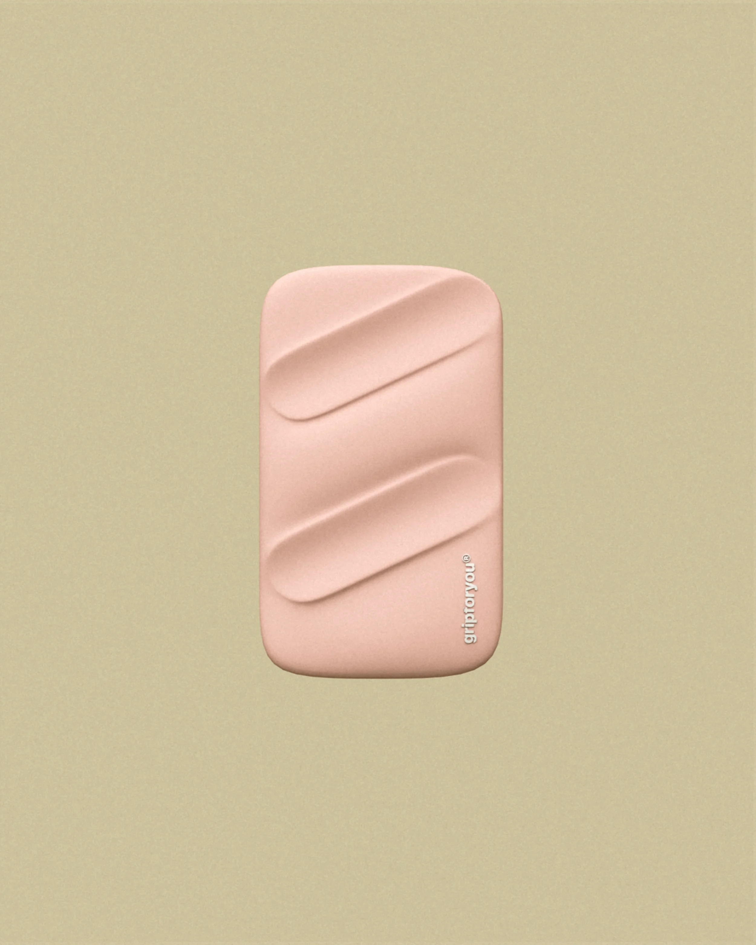
Two diagonal recesses follow the natural angle of the index and middle fingers. Each channel is well softened at the edges and integrated into the body, allowing the fingers to settle into the surface. The result is an organic, fluid form built around everyday hand placement.
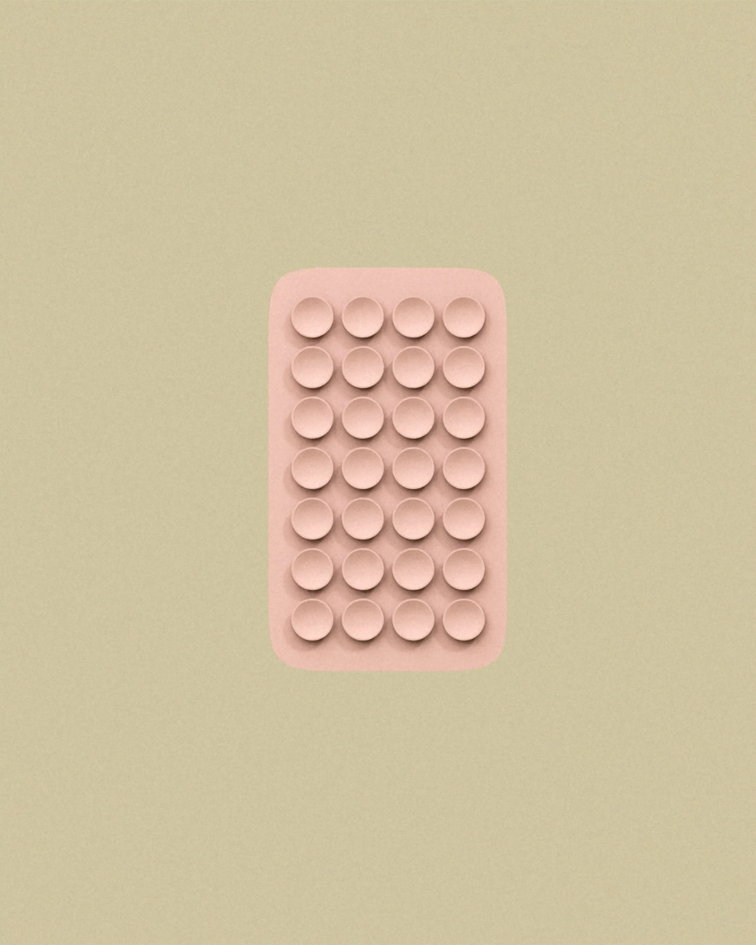
A grid of rounded circles explores repetition, spacing and touch. The raised details create a consistent pattern across the front surface, offering a different approach to grip and texture. The surrounding body remains smooth, with softly rounded corners and a simple outline.
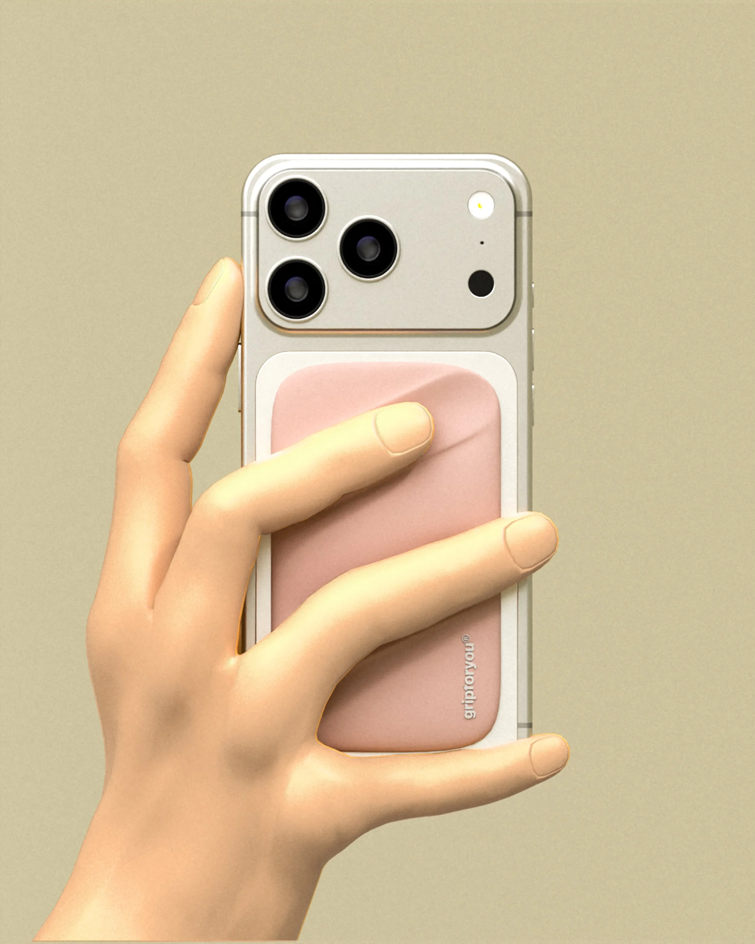
This view places a human hand directly onto the two diagonal channels, showing how the fingers naturally meet the recessed surfaces. The design responds to the position of the index and middle fingers, balancing a defined grip area with a gentle and uninterrupted outer shape.
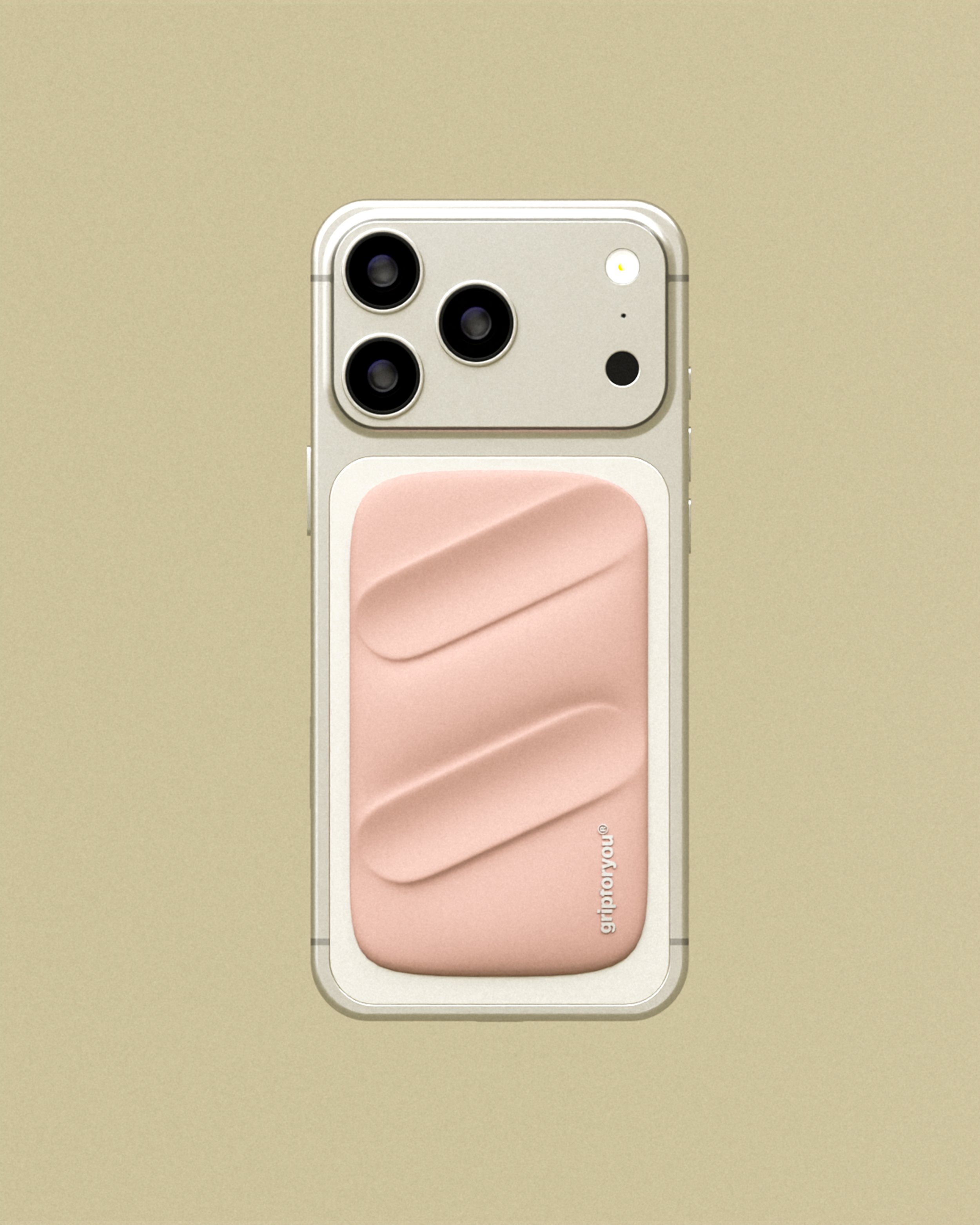
The two-channel design is shown attached to the back of a phone. Its pale pink colour contrasts with the phone, while the diagonal recesses remain the main feature. Rounded-off corners and a slender rectangular profile help this piece sit naturally within the phone's outline.
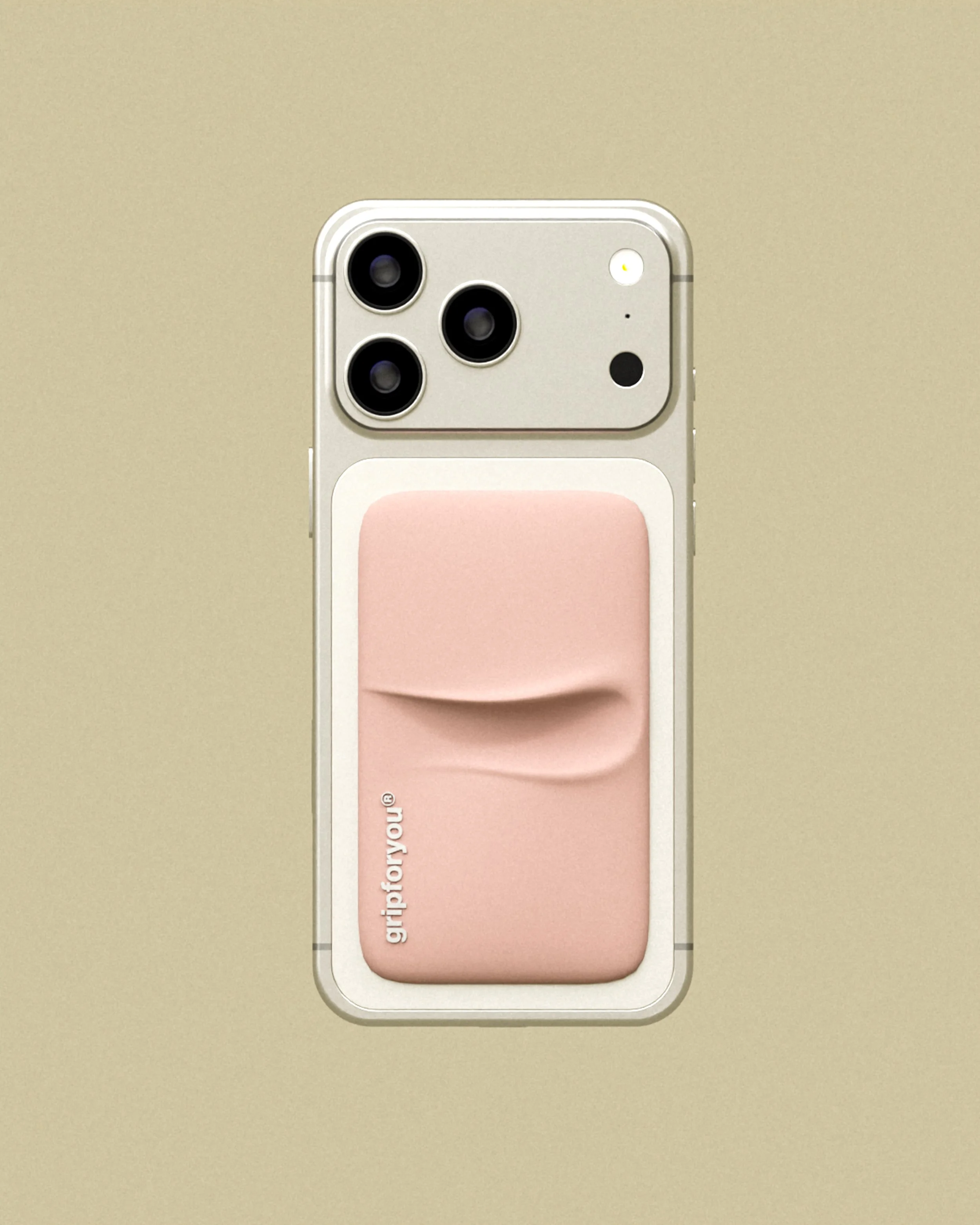
A single flowing indentation crosses the upper portion of the grip. The curved edge gives the otherwise simple body a sculptural quality, creating a very gentle shift in depth and shadow. Subtle branding along the side keeps attention on the shape and the smooth pink surface.
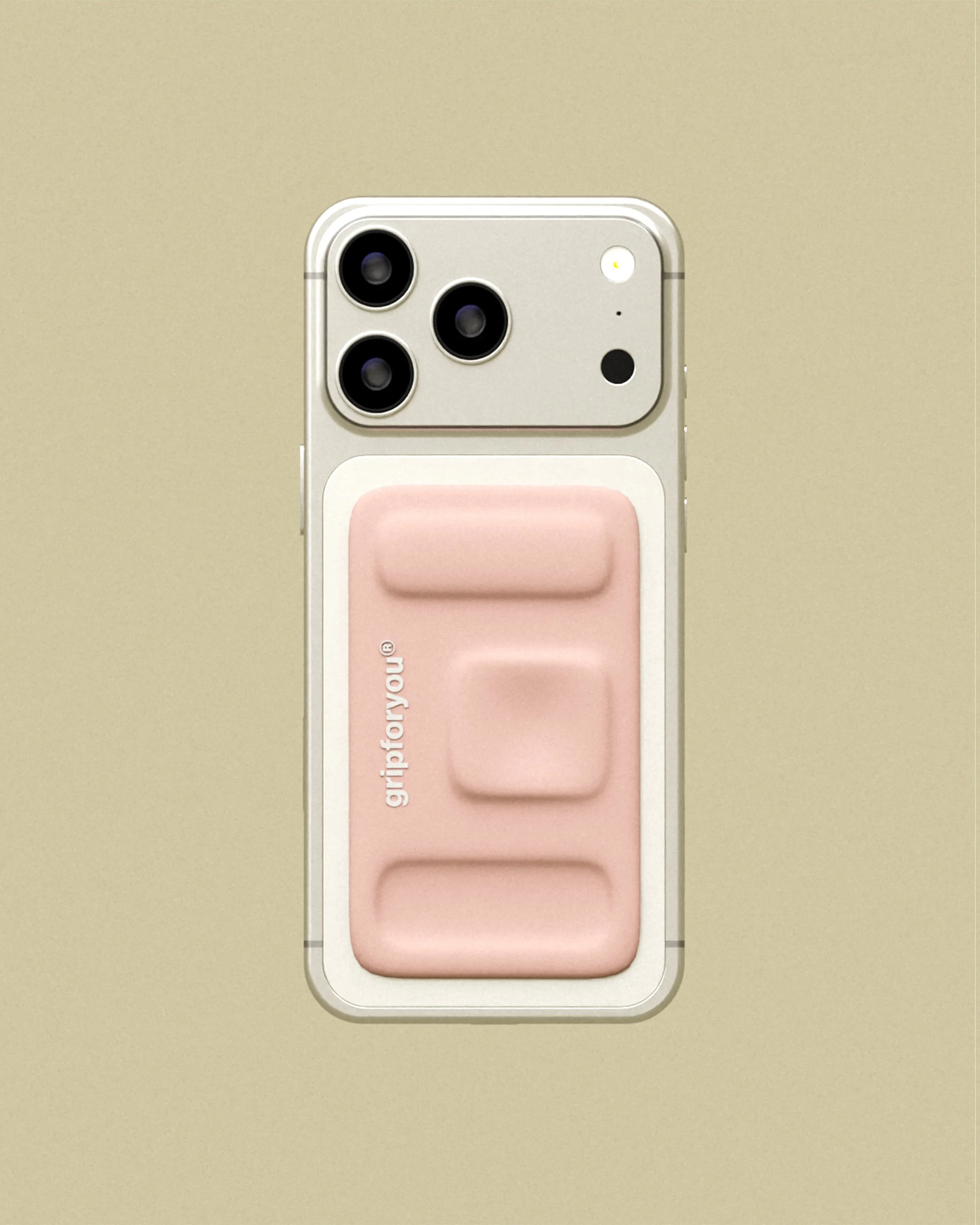
Three distinct rounded forms sit vertically across the surface. The top and bottom bars frame a larger square detail in the centre, creating a more clearly structured version of the organic grip. Each element has very soft edges and a slightly raised, cushion-like appearance.
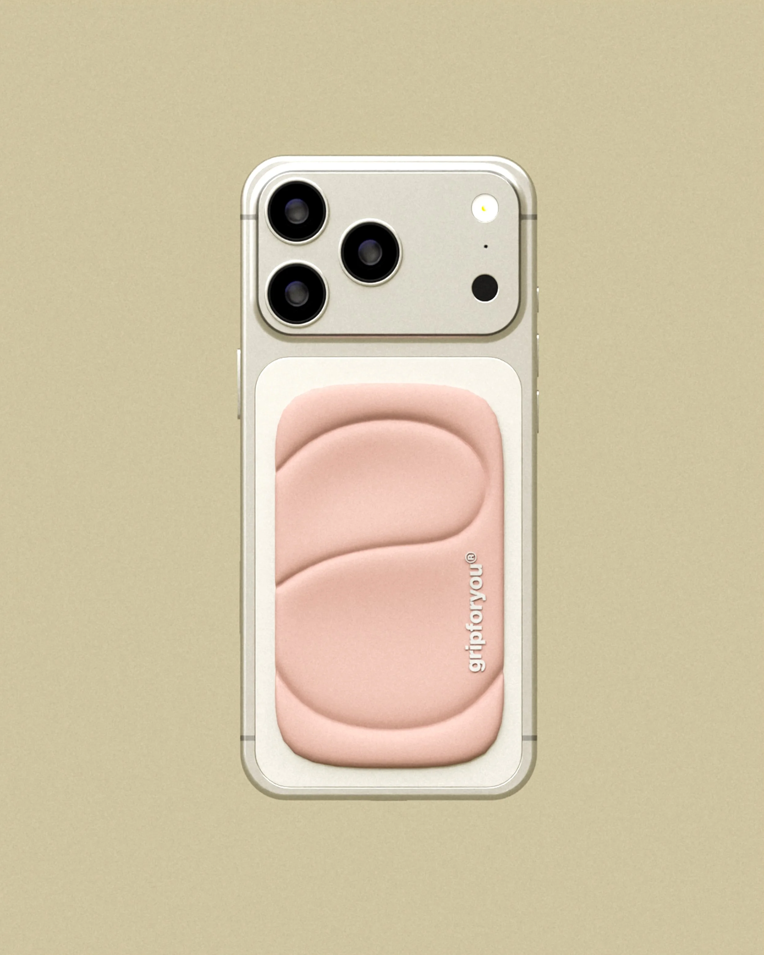
Two smooth curved channels sit one above the other, meeting in a continuous flowing shape. The design explores a more exaggerated finger placement, with broad, shallow recesses and smooth edges. A small vertical logo follows the side of the grip without interrupting the form.
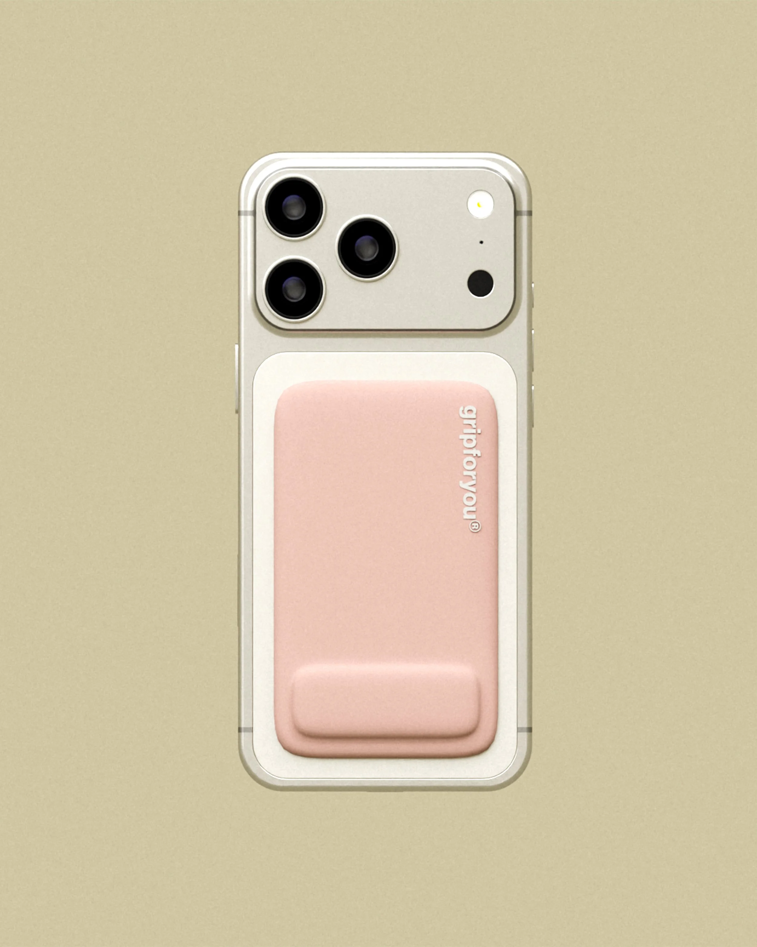
A single rounded bar sits along the bottom edge of the grip, leaving the top surface entirely smooth. This carefully reduced design explores how one neat raised detail can define an object. The pale pink body and subtle branding keep the overall appearance quiet and balanced.
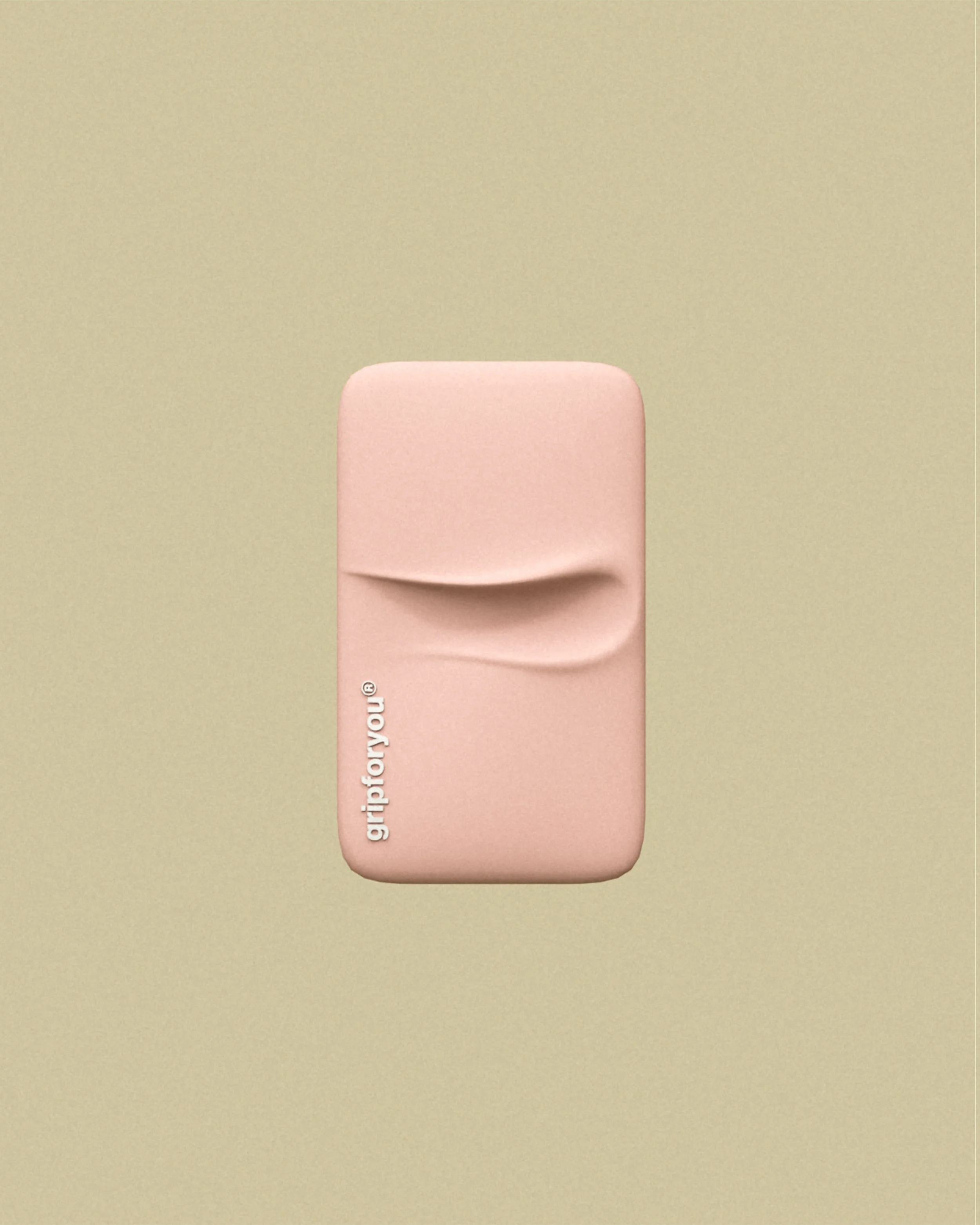
Shown on the back of a phone, the single curved indentation becomes the defining feature of this variation. The shape introduces a small pocket of depth across the upper half, while the remaining surface stays so smooth. Its placement keeps the silhouette simple and familiar.
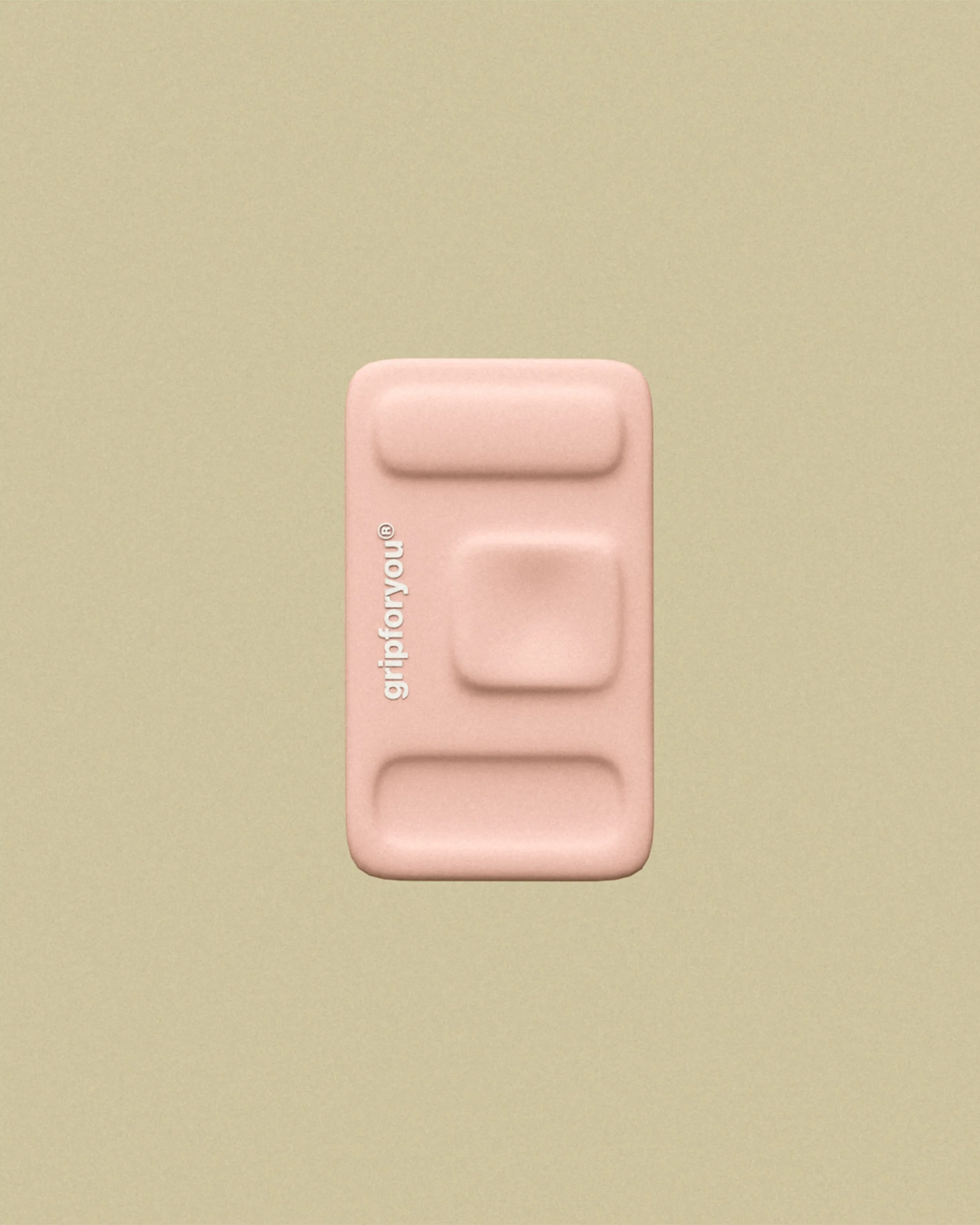
Mounted on the phone, the three-part grip creates a more distinctly architectural arrangement of plush raised shapes. Two horizontal bars surround a central rounded square, introducing different points of contact. The form maintains the same compact body and pale pink finish.
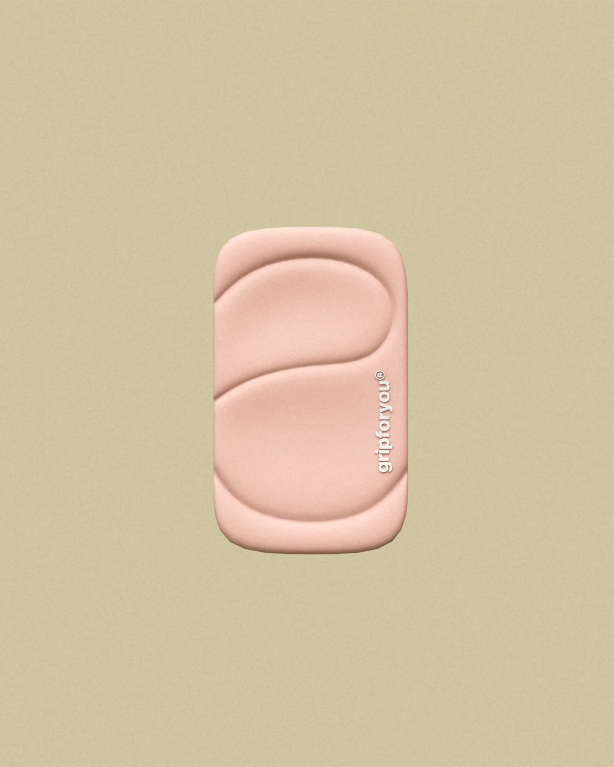
The pair of wide curved recesses is shown in context on the back of a phone. Their generous scale creates a flowing surface with subtle shifts in depth and shadow. The attachment retains the exact rounded rectangular silhouette, while the channels give it a distinct identity.
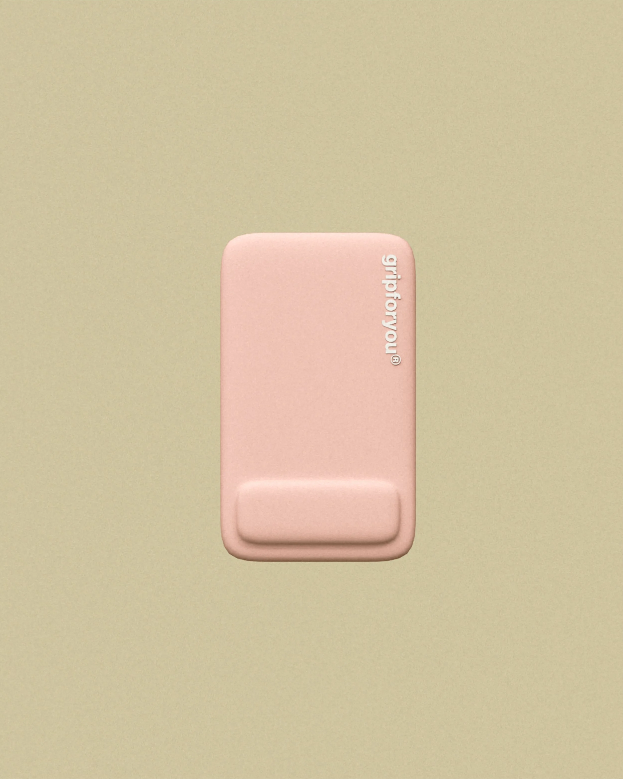
Shown on the phone, this variation uses a single raised bar at the bottom of an otherwise uninterrupted surface. The positioning gives the shape a quiet and minimal appearance. The small, vertical logo and rounded edge treatment are consistent with the rest of the collection.
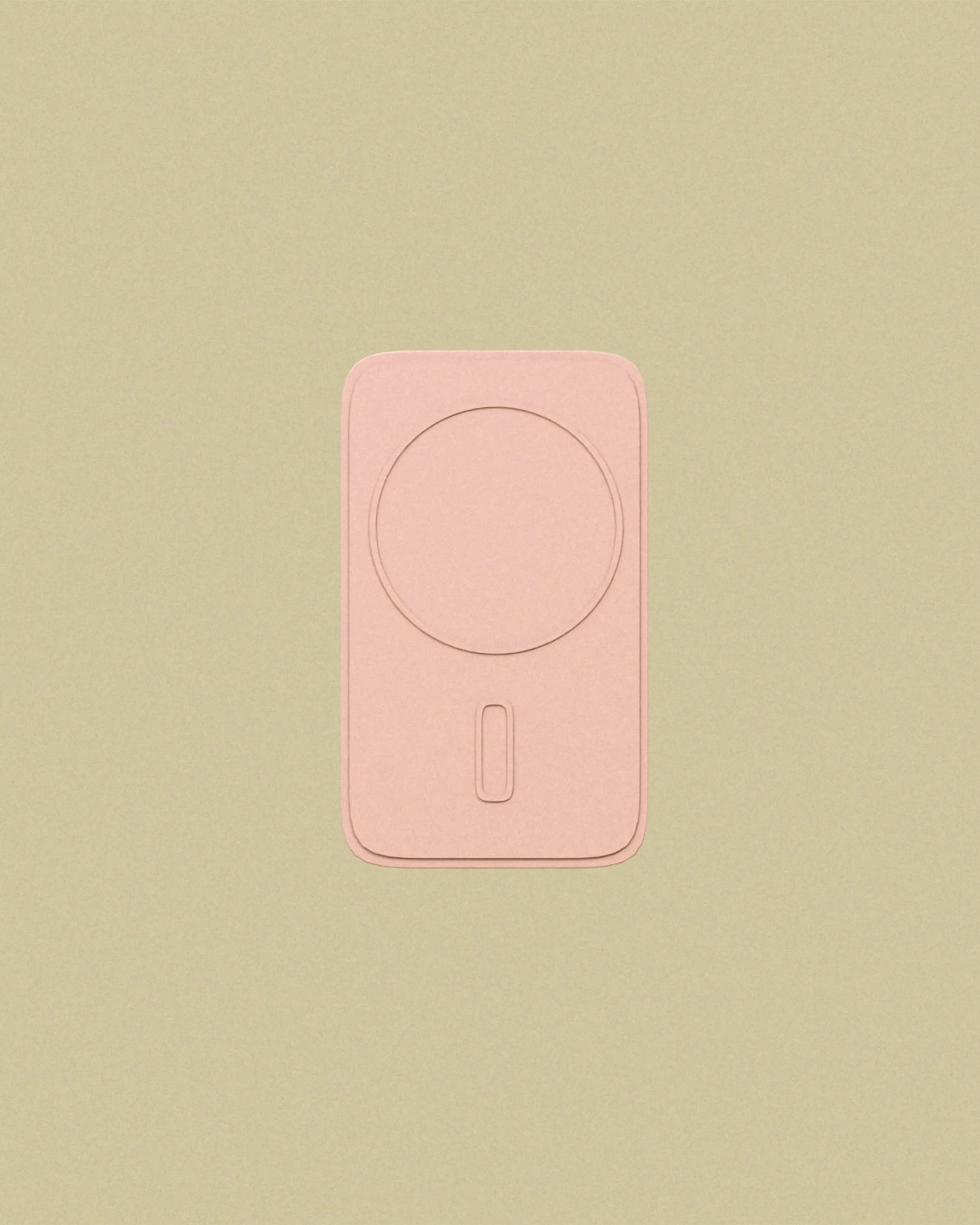
The reverse of the grip shows a circular attachment area and a small vertical detail below it. These elements sit within a softly rounded rectangular body, keeping the back as considered as the front. The design explores how functional components can be integrated so cleanly.
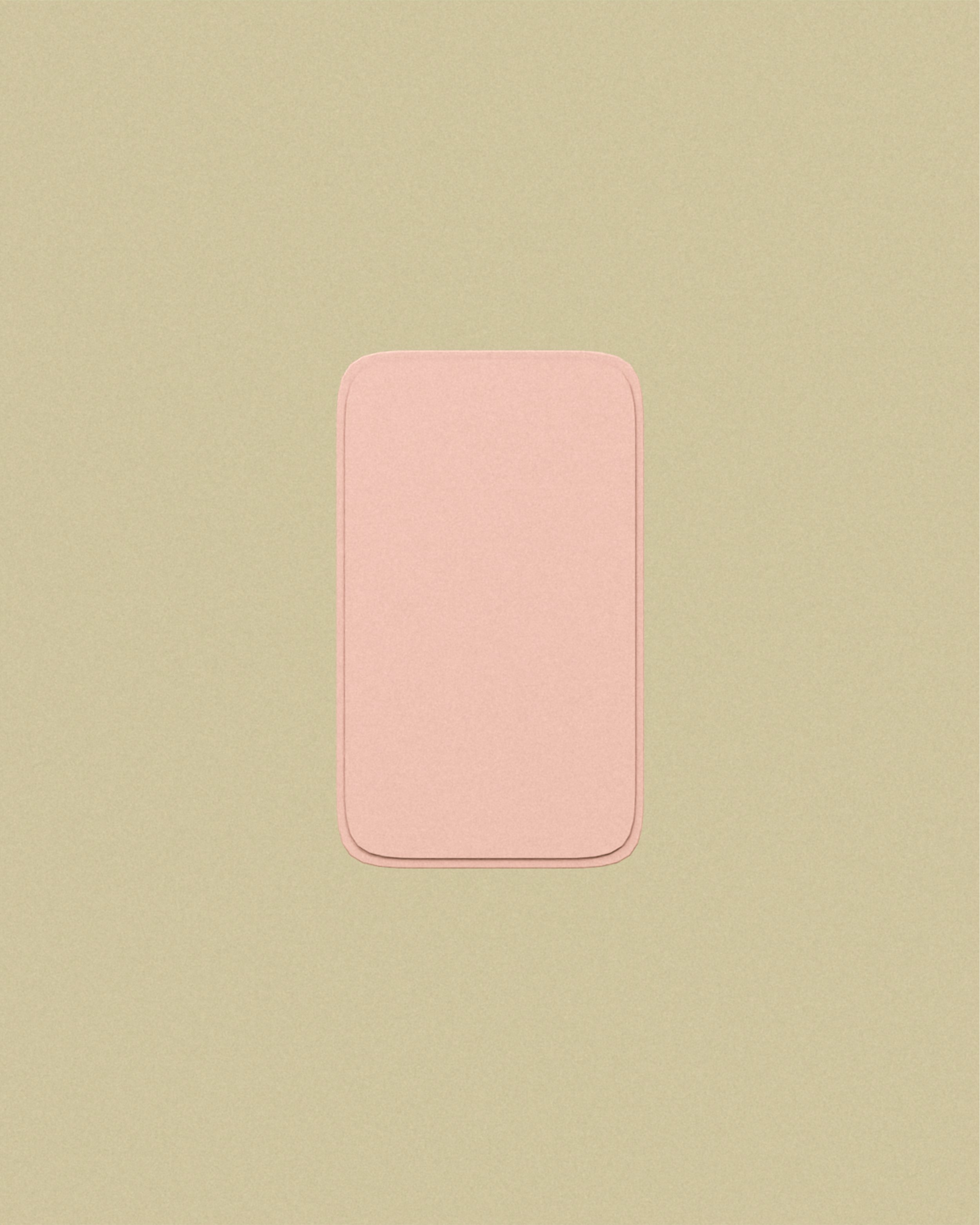
A plain view of the reverse surface puts the proportions of the grip in focus. The back is deliberately left uninterrupted, with gently rounded corners and a narrow border around the edge. It offers a quieter perspective on the same compact form shown throughout the lookbook.

The final image presents the gripforyou® wordmark against the same pale pink used throughout the collection. It brings the series back to its core visual language: rounded shapes, restrained colour and familiar proportions. A gentle closing point for the organic shapes study.